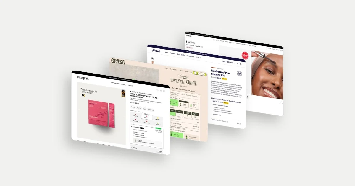
A shopper can want your product and still be unsure about buying it. The unanswered question might be whether the shade will suit them, whether the advertised price requires a subscription, or whether buying more actually makes sense.
A useful product detail page, or PDP, makes those decisions easier to understand. Its design has to connect what the shopper wants with what the business is asking them to buy.
Puresport, Graza, Freebird and Glossier show four ways to approach that task. Their pages are worth studying for the choices they make about commitment, quantity, price and proof. This analysis uses desktop captures dated 27 September–7 October 2026; it does not establish mobile behaviour, current offers or the stores' conversion results.
Give the subscription a reason beyond the discount
Puresport's flexible plan brings several kinds of value into one card: an introductory discount, savings on future orders, free delivery, permission to cancel, pause or skip, and a sports bottle on the second order.
Each detail answers a different question. The initial saving makes the first purchase more attractive. The future-order saving gives the recurring plan a continuing benefit. The cancellation language addresses the commitment. The bottle introduces a reward that arrives after the first purchase.
The interesting idea is the way the offer connects starting with continuing. Someone assessing a subscription needs to understand both. A large introductory saving alone does little to explain what the relationship looks like once that offer ends.
The Good's practitioner guidance recommends making subscription benefits clearer and explaining flexibility such as pauses. That supports a useful design hypothesis here: showing the value and the commitment together may help shoppers evaluate the plan. It does not tell us whether Puresport's execution increased subscriptions. The Good, subscription strategy guidance.
The card also states the cadence plainly: 30 servings delivered every two months. Putting the quantity and the interval side by side lets a shopper check the plan against how often they expect to use the product, which is exactly the comparison a replenishment offer invites.
Explore Puresport in the library.
Separate buying more from buying more often
Graza's buying panel distinguishes three decisions: the packaging format, how many units to order, and whether deliveries should repeat. Squeeze bottles, glass bottles and refill cans appear first. Quantity tiers follow, with savings and free-shipping messages. One-time purchase and subscribe-and-save options sit below them, followed by delivery frequency and refill preference.
This distinction matters because a larger order and a recurring order ask different things of a customer. Someone might want several bottles for one occasion without wanting regular deliveries. Another shopper might want one bottle replenished at a suitable interval.
For the business, quantity incentives create an opportunity to increase average order value: the value of a single order. A subscription creates an opportunity for repeat purchasing. Those outcomes can interact, but neither should stand in for the other when assessing performance.
The visual treatment also deserves attention. The panel repeats the product's green palette and distinctive type, carrying the brand into a fairly detailed purchase configuration. The commercial controls feel connected to the packaging. Distinct rows still give the choices a recognisable order.
Because each decision has its own row, the configuration stays readable even with several options on offer. A shopper can settle the format, then the quantity, then whether to repeat the order, and the one-time and subscribe-and-save choices sit together so the difference between this order and later deliveries is easy to see.
Make the condition behind the price easy to see
Freebird displays a $59.95 offer for the shaving kit with a blade subscription. Beneath that selection, the page states that blade refills cost $24.95 every six weeks and that the subscription can be changed or cancelled. The kit-only option shows $79.95.
The key buying question is therefore bigger than “Is this a good price?” It is “Which price applies to the arrangement I want?” The lower initial kit price presents a reason to consider recurring blade purchases. The refill price and interval explain the continuing commitment.
This is also where trust becomes more specific than adding a badge. The page shows reviews and a money-back guarantee, but those signals answer different questions from the subscription terms. Reviews provide customer testimony; the guarantee states a form of recourse; the refill details explain future charges. A reassuring badge cannot do the work of a clear offer.
The kit-only option stays on the page with its own $79.95 price, so the shopper can compare the subscription arrangement with a one-time purchase directly rather than having to search for the alternative.
Explore Freebird in the library.
Use imagery to answer a product-specific question
Glossier places a clean photograph of Boy Brow and its applicator beside a close-up of the product being applied to an eyebrow. Shade swatches sit in the buying area, with the selected shade named underneath.
For a colour cosmetic, appearance is part of the decision. The product shot shows the object; the application image adds context for where and how it is used. This combination gives the reader more to evaluate than packaging alone, while the surrounding short copy describes the intended finish and use.
The page also presents an Allure award badge. That supplies a different kind of reassurance: editorial recognition, which sits alongside the photography and shade labels rather than standing in for them. The photograph, shade labels and award each have a distinct role, and the analysis becomes more useful when we explain those roles separately.
Explore Glossier in the library.
Add commercial features only when their role is clear
These examples suggest a useful way to review a PDP: assign each element a question it needs to answer.
| Shopper question | Useful design response | What to watch |
|---|---|---|
| What will I receive? | Clear contents, quantity and product imagery | Attractive photography can still leave contents ambiguous |
| What am I committing to? | Initial and recurring price, cadence and adjustment terms | A strong introductory offer may overshadow the ongoing cost |
| Will this suit me? | Relevant variants, application or fit evidence | One example may not represent the buyer's needs |
| Should I add something else? | A relevant complementary item with enough detail to evaluate | Extra choices can distract from completing the original purchase |
That last question is where an AOV feature needs particular care. Baymard's research on PDP recommendations finds that insufficient information can make suggestions difficult to evaluate. A complementary item needs a recognisable image, a clear identity and price, with relevant supporting details. Adding a recommendation block is only the start; the shopper needs to understand why the item belongs in their order. Baymard, information needed in product recommendations.
Turn an example into a useful experiment
Start with evidence of a problem on your own store. CXL's hypothesis guidance connects research findings to a proposed change, a defined audience and an outcome that can be measured. That is a useful discipline for applying inspiration: identify the uncertainty before choosing the feature. CXL, From Data to Test Hypotheses.
For example, suppose customer interviews or support enquiries reveal that new buyers cannot distinguish your introductory subscription price from later charges. A reasonable hypothesis is that a concise “first order / future orders” explanation will improve understanding and help people choose an appropriate purchase option.
Test comprehension first. If the design becomes a controlled experiment, use completed purchase rate among eligible visitors as a primary outcome, and subscription mix as a diagnostic. Track unexpected-charge complaints and cancellations as guardrails. Follow the subscription cohorts through renewals before drawing conclusions about retention or lifetime value. Set the test's sample and duration around the effect you need to detect and your actual traffic.
The useful next step is to choose one buying question your current page leaves unresolved. Find an example that addresses the same question, then examine how its copy, controls and evidence work together. You can start with the product-page library or compare the decision areas in buy-box examples.