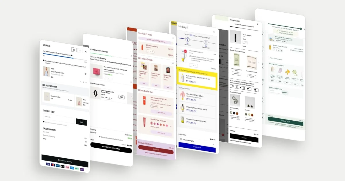
An announcement bar is the thin strip above a store's header: a promotional or service message, sometimes a moving ticker. It sits above the header, so it is usually the first thing on screen, and it has room for roughly one line. The useful question is not "what offer do we have?" but what does this one line need to settle before the shopper scrolls?
These ten examples come from stores in the library and are grouped by the job each bar does: shipping and basket size, urgency, trust and expectations, and subscriptions, launches and service. They are desktop homepage captures from late September to early November 2026. A capture shows one moment, so we cannot say how a rotating bar sequences its messages, how long a countdown runs or whether an offer is still live.
What an announcement bar can do
Most bars try to answer one shopper question. The same strip can ask a different one on every store:
| Job | The shopper's question | Seen here |
|---|---|---|
| Shipping and basket size | What will delivery cost, and what do I need to spend? | Summer Fridays, Caraway |
| Urgency and deadlines | Why now, and by when? | IM8, Buffy |
| Trust and expectations | Can I rely on this brand, and when will it arrive? | Allbirds, The Essence Vault |
| Subscriptions, launches and service | What else is on offer, and where do I get help? | Free Soul, Tula, Casper, Boll & Branch |
Two pieces of research help explain the choices. Baymard's checkout research says extra charges like shipping, taxes and fees are the leading cause of abandonment, and reports that 40% of users abandoned a checkout because of additional costs at checkout. A bar that states the shipping threshold puts that cost in front of the shopper early. Whether it changes behaviour on a particular store is something only that store can measure.
The second is about movement. Nielsen Norman Group's study of auto-forwarding panels found that rotating content is seen less often, because only one item shows at a time (in its example, an offer was visible 20% of the time), that moving elements hurt people with motor difficulties or slower reading, and that users lose control of the page. The article is about homepage promotion boxes, not announcement bars, but the point carries over: a bar that moves should give the visitor some control.
Shipping and basket size
1. Summer Fridays: state the threshold and link the conditions
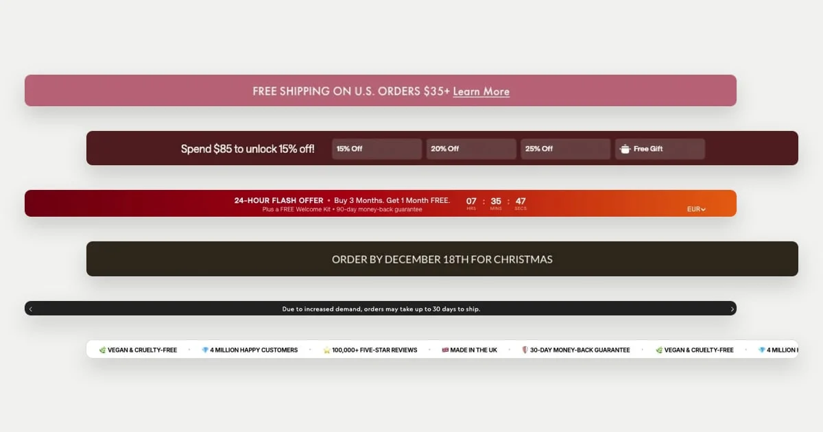
Summer Fridays keeps to one message and one number: "Free shipping on U.S. orders $35+", followed by an underlined "Learn More". The bar names the market and the threshold, and the link gives the conditions a place to live, so the line itself can stay short.
2. Caraway: show the ladder, not just the first rung
Caraway's bar says "Spend $85 to unlock 15% off!" and shows four steps beside it: 15% off, 20% off, 25% off and a free gift. A single threshold tells a shopper what they can get; the ladder also shows what more spending earns. It is a bar that doubles as a small progress display.
Urgency and deadlines
3. IM8: attach the deadline to the offer and the guarantee
IM8 packs the most into one strip. The headline is a "24-hour flash offer: Buy 3 months, get 1 month free". A smaller line adds "Plus a free welcome kit" and a 90-day money-back guarantee. A clock reads 07 hours, 35 minutes, 47 seconds, and a currency selector sits at the far right. The deadline, the incentive, the risk reducer and the currency all appear without a second click.
We captured one moment. We cannot say whether the clock runs for every visitor or resets, so this example is about how the bar is laid out, not how the timer behaves.
4. Buffy: a deadline that is a delivery fact
Buffy's message is "Order by December 18th for Christmas". There is no discount and no countdown. The urgency comes from the calendar: a date by which a gift will arrive. The library's review notes record that this bar rotates with a Black Friday message; this capture shows the deadline.
Trust and expectations
5. Allbirds: set the delivery expectation before checkout
Allbirds uses its bar for the plainest kind of message: a fact about delivery, stated in one sentence, "Due to increased demand, orders may take up to 30 days to ship." It tells shoppers what to expect before they put anything in the basket, so the information is not a surprise later.
6. The Essence Vault: a ticker of reasons to trust
The Essence Vault's bar is a moving row of short claims: "Vegan & cruelty-free", "4 million happy customers", "100,000+ five-star reviews", "Made in the UK" and "30-day money-back guarantee", each with a small icon. It answers several trust questions at once and leaves the offer to the rest of the page. The numbers are the brand's own claims; we did not verify them.
Subscriptions, launches and service
7. Free Soul: three offers, one ticker
Free Soul's ticker runs three short offers in capital letters: "20% off when you subscribe", "Free UK delivery on 1st subscription order" and "Refer a friend". All three point toward the same behaviour, subscribing and sharing, so the bar sells one business model in three phrases rather than three unrelated promotions.
8. Tula: lead with NEW, then give the benefit
Tula's bar opens with a bold, underlined label, "NEW! Holiday sets:", then finishes the thought with a benefit, "Glow beyond the season & save up to 40%". The label says what the message is about and the second half says why it matters, in a single line. The library's review notes record that this bar rotates with a wallet-credit message and a skin-quiz message; this capture shows the holiday sets.
9. Casper: use the bar as a service shelf
Casper splits the bar into three parts: "Find a store" with a pin on the left, "Connect with a Sleep Specialist" in the centre, and "Refer a friend" with a gift icon on the right. There is no sale. The bar offers routes to help and to people, which may suit a category where shoppers want to try the product or ask for advice first.
10. Boll & Branch: a code, a link and a pause control
Boll & Branch's bar says "20% off Signature Sheets & Waffle Bed Blankets | Save with code ICON | Shop Now", with links to Origin Track, About Us and Stores on the right. At the left edge sits a pause button. For a message that can change, a visible control gives the visitor the control that Nielsen Norman Group says moving content should offer. We did not test what the pause button does.
Before you copy one
These checks apply to any announcement bar, not to the stores above.
- Choose one job. If you must carry several messages, make them support the same goal, as in Free Soul.
- Keep the line short. One message and one link survive a narrow screen better than three offers.
- Make the facts true. A countdown, a delivery date or a threshold should match what the store actually does, or the bar costs more trust than it earns.
- Check the phone. These are desktop captures. Look at the bar's height, its truncation and its tap target on a real phone.
- Give moving bars a control. An arrow or pause button lets visitors read at their own pace.
To browse more, see every announcement bar in the library. The shipping threshold often continues in the cart, which our cart drawer examples cover.
 Summer Fridays
 Caraway
 IM8 Health
 Buffy
 Allbirds
 The Essence Vault
 Free Soul
 TULA
 Casper Sleep
 Boll & Branch