A subscription product page sells two things at once: a product for today and an agreement about what happens next. A shopper can like the product and still hesitate because the renewal price, delivery interval or ability to change the order is unclear.
The useful design question is therefore how do we make the recurring purchase understandable before asking someone to choose it? These ten examples show different answers, from introductory discounts and refill formats to delivery benefits and control over future orders.
Most include a subscribe-and-save price. Two show a broader subscription proposition: Topicals foregrounds shipping, while Seed presents a monthly supply. They are included because the shopper's recurring commitment matters even when a percentage discount is not the main message.
We selected these dated desktop captures for distinct explanations of the subscription choice, not measured sales results. Prices and promotions describe the captured state. Selected controls do not establish defaults, and account-management or cancellation journeys were not tested.
Explain the first order and the next one
A product detail page, or PDP, should help someone understand the product, quantity, price and purchase action. A subscription adds another set of questions: how often, what renews, what changes after an introductory offer, and what control the customer retains.
The Good's subscription guidance recommends clearer benefit information and explanations of flexibility. We use that as practitioner guidance, not evidence that any featured layout increases revenue.
| Question | Information to make clear |
|---|---|
| What do I pay now? | First-order total and any introductory benefit |
| What happens next? | Recurring item, price and delivery interval |
| Can I change it? | Relevant skip, pause, edit or cancellation terms |
| Why subscribe? | A benefit linked to this product and its use |
10 subscription product page examples
1. Puresport: separate the introductory offer from the ongoing benefit
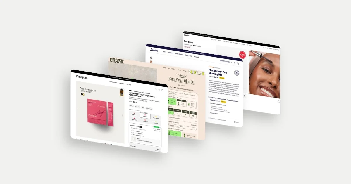
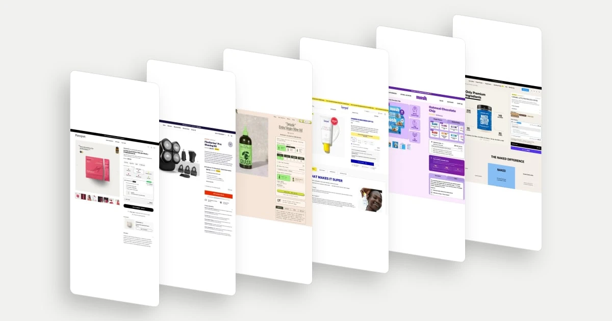
Puresport groups the flexible plan's price, delivery interval and benefits into one outlined area. It distinguishes the first-order offer from the saving on future orders and identifies a gift attached to the second order. That creates a timeline within the buy area: what the shopper receives now, what continues, and what arrives later. The gift has a different role from the initial discount because its value depends on continuing the relationship.
Explore Puresport in the library.
2. Freebird: explain what is actually replenished
Freebird presents the shaving kit with a blade subscription alongside a kit-only alternative. The recurring item is the blade refill, not another complete shaver. A refill price and interval sit within the subscription explanation, so the lower kit price has context. This is a useful model for durable products with replaceable components: the offer can connect a one-off equipment purchase to an ongoing maintenance need.
Explore Freebird in the library.
3. Graza: show how the first package differs from refills
Graza separates the initial product format from the refill preference and then lists first-order and recurring contents. That distinction answers a practical ownership question: after buying a bottle, what will arrive next? Frequency is shown alongside the subscription option, while the summary keeps packaging choices concrete. The recurring proposition is about replenishing an everyday product in a chosen format, not just repeating an identical checkout.
4. Supergoop: keep product size distinct from purchase frequency
Supergoop presents size choices before the one-time and subscribe-and-save alternatives. The subscription explanation includes a saving, shipping and ways to adjust future deliveries. This treats product configuration and purchase commitment as separate decisions. Someone can first decide which format belongs in their routine and then assess whether recurring delivery makes sense for how they use it.
Explore Supergoop in the library.
5. MOSH: make changing preference part of the proposition
MOSH combines flavour selection with a subscription panel that names the ability to skip, pause, swap flavours or cancel. For a food product, preference can change before the need for replenishment disappears. Explaining flavour flexibility addresses that specific uncertainty. The visible schedule and recurring saving make the purchase arrangement concrete, while the range of flavours shows what future variety might mean.
6. Naked Nutrition: distinguish the first shipment’s saving
Naked Nutrition's Autoship panel gives the first shipment and following shipments separate savings statements. The schedule is inside the same selected area, so timing and price are read as parts of one agreement. That is a useful design choice for an introductory incentive: the larger initial percentage does not have to carry the whole explanation. The alternative one-time option remains part of the same comparison.
Explore Naked Nutrition in the library.
7. AG1: distinguish a monthly equivalent from a bill
AG1 Pro compares supply durations and shows a monthly equivalent alongside the amount billed for the selected period. Those numbers answer different questions: the equivalent helps compare value, while the bill describes the actual commitment. A per-serving figure adds another comparison basis. This is useful when a larger delivery can be framed as better value but still requires a larger payment at once.
8. Free Soul: separate first-order extras from replenishment
Free Soul groups the recurring saving, delivery cadence and flexibility within the subscribe-and-save panel. Gifts are separately labelled as first-order additions. The visual distinction gives the extras a clear place in the offer without suggesting they recur indefinitely. It also lets the shopper understand the core subscription even if the gifts are not their main reason to buy.
Explore Free Soul in the library.
9. Topicals: make delivery the reason to subscribe
Topicals places a subscription action focused on free shipping next to the standard purchase action. In the captured state, both show the same product price. The visible distinction is therefore delivery value, rather than a cheaper item. This is a useful reminder that a subscription's appeal can come from removing a recurring inconvenience or charge, not only from reducing the merchandise price.
Explore Topicals in the library.
10. Seed: put the cadence into the basic product proposition
Seed places a monthly delivery statement directly beneath the price, together with a pause-or-cancel message. The recurring arrangement is introduced as part of the product's basic purchase proposition. A visitor does not need to interpret a percentage-saving badge to recognise the schedule. The page illustrates a subscription framed around continuity of supply, with the product and its replenishment described together.
Match the measure to the recurring relationship
A subscription selector primarily asks for subscription adoption and repeat purchasing. It does not automatically increase average order value (AOV), which is revenue per order. An introductory discount may reduce the first order's revenue even if the customer returns later. A larger supply can raise the immediate charge while changing the time until the next shipment.
Before redesigning your offer, ask customers to explain the first charge, next charge, interval and available changes in their own words. Use the misunderstandings to decide what needs clarification.
For a wider view of purchase decisions, read what makes a high-converting product page. Its product-choice framework complements the recurring-commitment decisions here.