A beauty ad has to make a product relevant before the shopper can evaluate it. Sometimes that means showing where it belongs in a routine. Sometimes it means addressing a specific doubt, translating a sensory benefit or making an offer easy to understand.
The useful question is what does this creative help a potential buyer understand? A person holding a bottle is a format. Giving that person a recognisable situation, question or demonstration is the creative argument.
These fifteen examples cover beauty and adjacent personal-care brands. We selected them for distinct messages and visual choices, not ad performance. The saved records come from Meta's Ad Library and were checked in September and October 2026. They do not verify Facebook-only placement or actual audience targeting. Video examples are analysed as saved stills: we do not claim to have reviewed their opening seconds, sound or full sequence. Promotions shown are historical references.
Choose the argument before the format
UGC means user-generated content. Here, UGC-style describes informal, creator-like presentation; it does not establish that an unpaid customer made the ad. A casual frame can still be carefully produced, and a polished product image can still communicate a very practical benefit.
| Shopper question | Creative direction |
|---|---|
| What would this add to my routine? | Use context or a clearly named product role |
| What will it feel or look like? | Sensory language, texture or visible application context |
| Why should I consider this one? | A specific difference, relevant proof or an objection addressed |
| Why act on this offer? | Clear contents, conditions or a genuine release occasion |
These are interpretations of the messages, not confirmed targeting segments. Start from evidence about your own audience before deciding which question deserves an ad.
15 beauty and personal-care ad examples
1. Blank Body Beauty: make sensory value easier to imagine
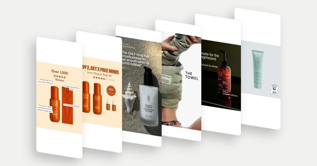
Blank Body surrounds the oil with attributed customer-style remarks about scent, softness and glow. That gives a product people cannot smell or touch through a screen several concrete points of appeal. The comments do different jobs rather than repeating a generic claim of quality. The pack remains central, connecting those experiences to an identifiable item. For a shopper considering body oil, the creative makes the sensory part of the purchase easier to picture.
Explore Blank Body Beauty in the library.
2. Blank Body Beauty: make the bundle countable
The offer pairs two full-size bottles with two minis, and the image shows that combination directly. A shopper can connect the headline to the physical contents without constructing the bundle mentally. The smaller bottles also make the extra items visibly different from the main purchase. A rating beneath the offer introduces another consideration alongside price: the product has a body of customer feedback, as presented by the brand.
Explore Blank Body Beauty in the library.
3. Crown Affair: let a testimonial name the situation
Crown Affair's saved frame pairs its leave-in conditioner with a quotation about keeping hair smooth in humid weather. That situation is more informative than general enthusiasm: it tells the reader when the product mattered to the quoted person. The product remains visible beneath the text, and a retailer reference provides a recognisable shopping context. The strategic lesson is specificity, rather than treating the presence of a testimonial as sufficient persuasion.
Explore Crown Affair in the library.
4. Crown Affair: show the product’s role through handling
The towel creative shows the product being handled on a person's head. Its shape, texture and role can be understood together, supported by a short product label. This is particularly useful for an accessory that could look undifferentiated in a folded pack shot. The frame introduces the object as part of a hair-care ritual and makes the physical action legible without a long explanation.
Explore Crown Affair in the library.
5. maude: give the product a place in everyday life
maude connects the product to a nightstand and presents the bottle with restrained, familiar visual styling. The message gives an intimate-care item an ordinary place in the home. That is a positioning choice as much as a packaging choice: the category is introduced through everyday use and design, rather than requiring a technical explanation in the frame. This adjacent personal-care example shows how a setting can carry meaning with very little copy.
6. Dieux: choose proof that relates to a specific concern
Dieux places a specialist acceptance seal beside the product. The choice connects a named source of recognition with the kind of concern a visitor may be considering, rather than using a generic trust symbol. The spare composition gives that relationship room to register. The seal is part of the brand's presented evidence; this review does not independently validate the certification or turn it into a broad efficacy claim.
7. Dieux: make reuse a product idea
Dieux shows the eye masks inside their storage tin and foregrounds reusability in the copy. The container helps make that proposition tangible: this is an item to keep and return to, not simply discard after use. The illustration and collaboration styling add a collectible quality, while the physical presentation explains how the object fits a repeated ritual. Product design and the message reinforce the same idea.
8. Sol de Janeiro: connect a new category to familiar brand cues
Sol de Janeiro presents candles using the colours and numbered scent identities visible on the products. The limited-edition message supplies an occasion, while the recognisable packaging connects the collection to the brand's wider sensory world. For someone familiar with those scent names, the creative can introduce another way to experience them. For someone new, it still clearly identifies a candle collection.
Explore Sol de Janeiro in the library.
9. Supergoop: explain the product’s place between categories
Supergoop names a combined role: SPF primers. That connects sun protection with a makeup-related step and gives the viewer a reason to consider the products within an existing routine. The people and visible tubes provide a friendly presentation, but the category bridge is the important argument. The ad is not merely saying that the products exist; it is explaining where they belong.
Explore Supergoop in the library.
10. Supergoop: make the desired finish the focal point
The Glowscreen frame puts a face, the product and a finish description together. That gives the skincare or makeup shopper a concrete aesthetic question to consider: whether this is the kind of finish they want in their routine. The product is identifiable, and the message is narrower than a general promise of looking better. The still supports discussion of presentation and positioning, not a conclusion about application performance across skin types.
Explore Supergoop in the library.
11. Tower 28: anchor the message in a recognisable occasion
Tower 28's frame connects the spray to a workout setting through both the scene and the on-screen message. The occasion makes the product relevant to a particular moment rather than leaving the viewer to invent one. The health-related explanation in the text is an advertising claim, not a finding established by our review. The useful creative lesson is the connection between a recognisable activity and a reason to learn about a product.
Explore Tower 28 in the library.
12. Sweet Bee Organics: make the arrival experience tangible
Sweet Bee's frame shows hands holding a jar above the opened branded parcel. The viewer can see the packaging, label and scale of the physical product together. This turns delivery into part of the product story: someone considering an unfamiliar brand can picture what arriving home with an order might look like. The informal presentation supports that perspective without establishing who filmed it or whether they were an independent customer.
Explore Sweet Bee Organics in the library.
13. SHYNE: frame an aspiration in the viewer’s language
SHYNE's still uses a short question about the appearance of curls, paired with a labelled before image. The wording makes the desired outcome recognisable without requiring the viewer to know the product name first. It also establishes a comparison premise. Because only this frame was reviewed, there is no claim here about the later result or whether a transformation is demonstrated convincingly.
14. Hey Bud: put a comparison question into the creative
Hey Bud displays a comment asking how the product differs from other neck creams. That gives the creative a precise question to answer: why consider this option rather than a familiar alternative? The product held in front of the camera keeps the discussion attached to the item. The reply-style format makes the comparison feel like a conversation already in progress, though the saved frame does not establish the full answer.
Explore Hey Bud in the library.
15. Smooche: connect a shopping occasion to a destination
Smooche combines a familiar retail event, a large promotional figure and a reference to its own website. The product and visible texture keep the promotion attached to something tangible. The creative's useful idea is to give a deal-seeking viewer both an occasion and a next destination. The image alone does not establish the offer conditions, destination experience or the profitability of selling through that route.
Explore Smooche in the library.
Turn the reference into a creative brief
Start with one question your prospective buyer needs answered. Write the argument in a sentence, choose evidence that supports it and decide what the viewer should do next. Only then choose a format: creator-led explanation, product demonstration, testimonial, offer graphic or brand image.
For example, if research shows that people do not understand when to use a product, a routine demonstration is a more coherent hypothesis than simply requesting more UGC. If people understand the category but question the difference, a comparison argument may be the more useful brief.
CXL's hypothesis guidance starts from evidence about a problem and connects the proposed change to an audience and outcome. Apply that discipline to creative testing: keep the offer and destination comparable where possible, identify the audience under study, and assess qualified visits and purchases alongside attention measures. A higher click-through rate alone cannot establish that the ad brought better buyers.
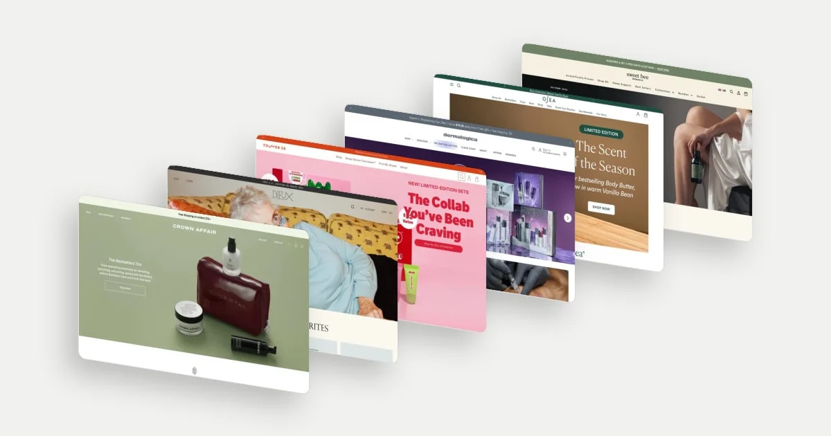
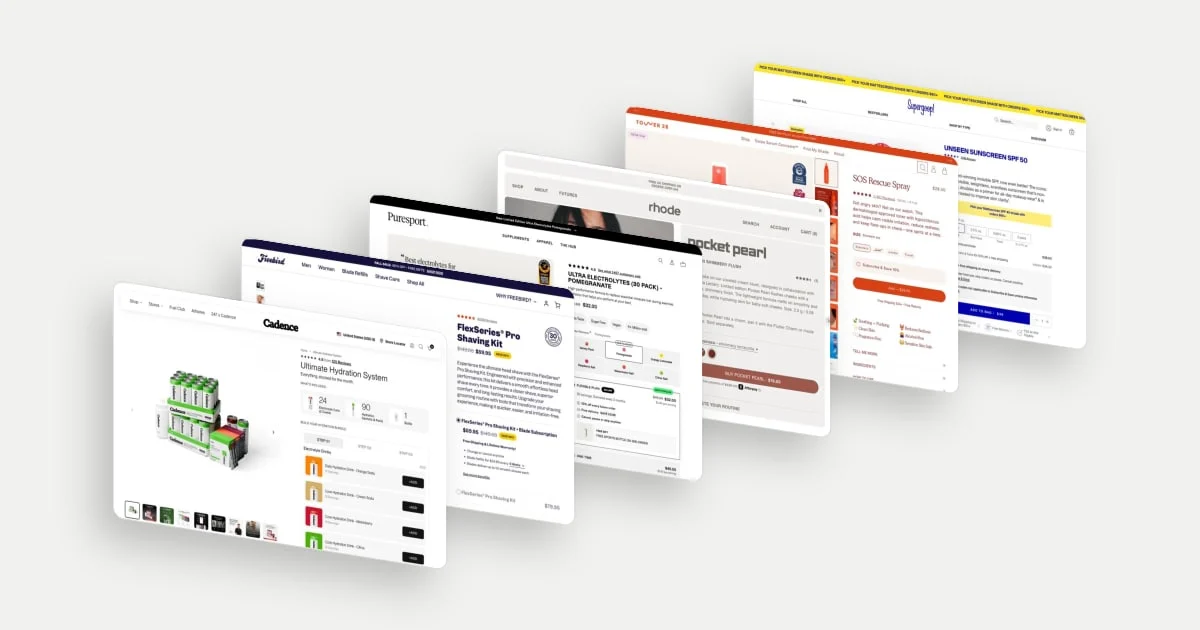
Our beauty homepage examples and product page examples show how brands continue product discovery and decision support on the store itself.