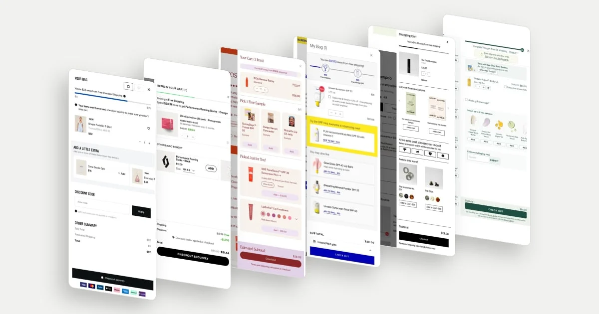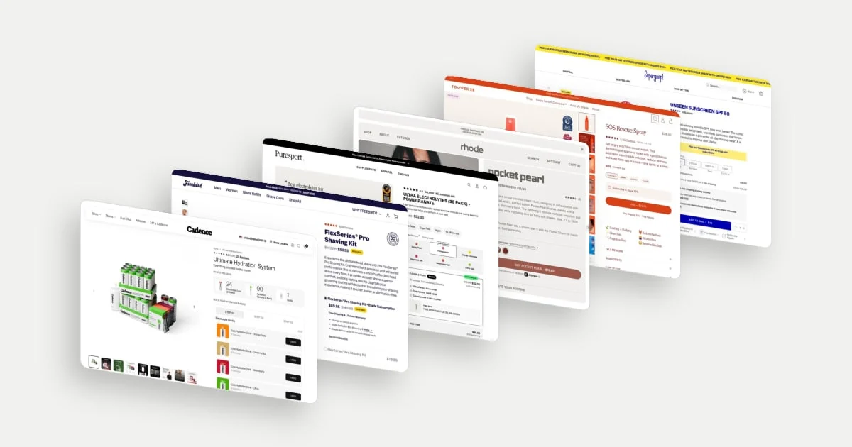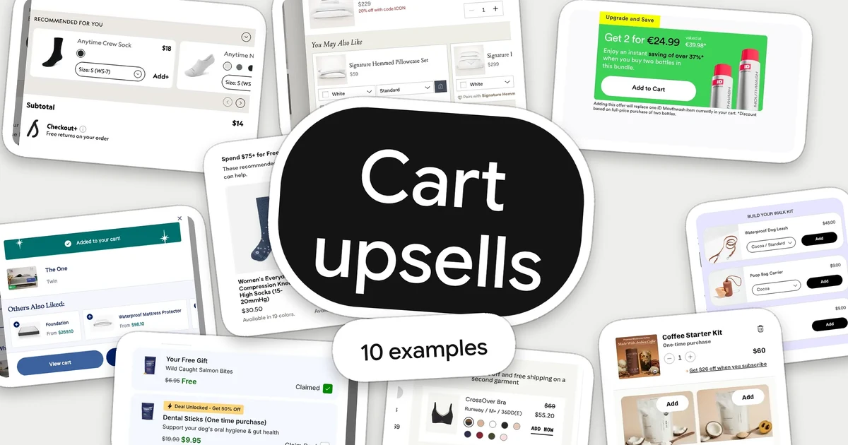
A cart upsell is a product or offer suggested to a shopper after they have chosen something. Some suggestions complete the purchase (a leash with a harness), some raise it (a bigger set) and some add a benefit (a deal on a second item). The cart is a good place to look at them because the shopper has already decided what they came for.
These ten ecommerce cart upsell examples were selected because each handles a different part of the job: choosing the right product, setting its options, showing the price and making clear what happens to the order. “Best” is not claimed. Each shows a clear, deliberate approach worth studying, and none is a conversion-rate ranking. The screenshots are populated desktop states captured between September and November 2026, cropped to the suggestion area. Controls, mobile behaviour and checkout flows were not interaction-tested. For the drawer layouts these suggestions sit in, see 10 ecommerce cart drawer examples.
Four questions a cart upsell has to answer
- Is it relevant to what I chose? Baymard’s cart research says the usefulness of suggestions is tied to their relevance to the basket, and that even one questionable suggestion can make shoppers stop trusting the rest. Its benchmark, published in January 2021, found that 52% of the desktop sites it studied showed cart suggestions that were irrelevant or based only on what other customers bought. Read the research.
- Can I add it without leaving? Size, colour and quantity choices decide whether adding is one step or a trip back to a product page.
- What does it cost, and what do I save? A shopper should not have to work out a reduced price.
- What happens to my order? An add-on, an upgrade and a subscription each change the basket differently, and the cart is where that change should be stated.
Baymard also recommends labels that define the context of a suggestion and priority for items that depend on what is in the basket. On mobile, it notes that the smaller screen makes it harder to review a cart that is crowded with suggestions. This article shows desktop only, so treat the examples as a starting point and check small screens separately.
10 ecommerce cart upsell examples
1. Wild One: build a set around the item in the cart
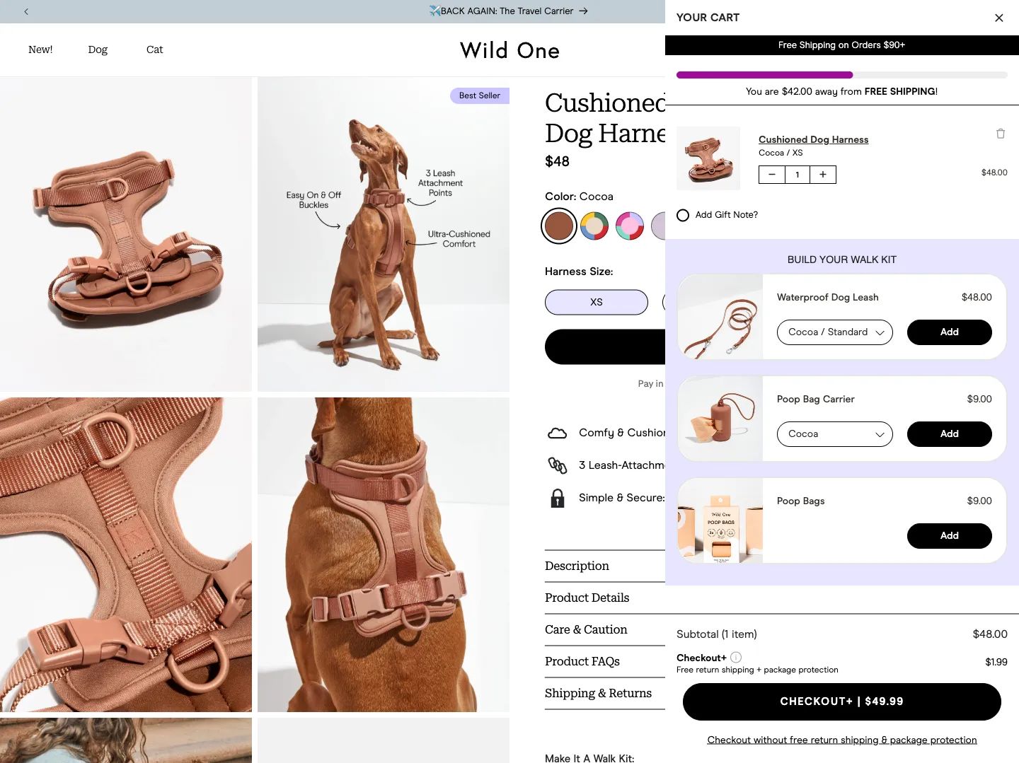
Wild One’s cart shows a “Build your walk kit” panel under a Cushioned Dog Harness in Cocoa. It lists a Waterproof Dog Leash ($48), a Poop Bag Carrier ($9) and Poop Bags ($9), each with its own Add button. The leash and carrier show Cocoa, the colour named on the harness line.
The panel gives the extras a job: finishing the kit a dog owner needs on the first walk. Naming the set answers “what else do I need with this?” before the shopper has to ask, and the pre-matched colour spares them re-opening a product page to choose. Each row carries its own price, so a $9 add-on reads as small beside a $48 item.
2. Casper: offer the items the main purchase depends on
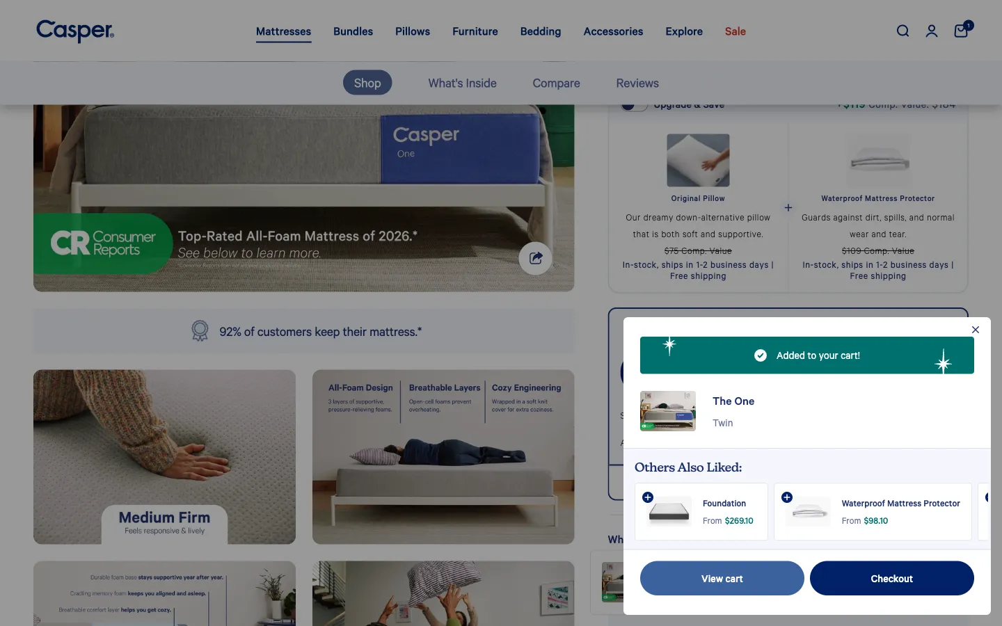
Right after a mattress (The One, Twin) is added, Casper’s “Added to your cart!” confirmation lists Foundation (from $269.10) and Waterproof Mattress Protector (from $98.10), each with a plus button, above View cart and Checkout.
These are things a mattress buyer is likely to need to use or protect the mattress, so the suggestions answer a real next question instead of filling space. Baymard’s cart research gives precedence to compatibility-dependent items, and the confirmation moment is when the shopper has just committed to the main product. “From” prices signal that options come later, which keeps the confirmation short.
3. Boll & Branch: say what each suggestion goes with
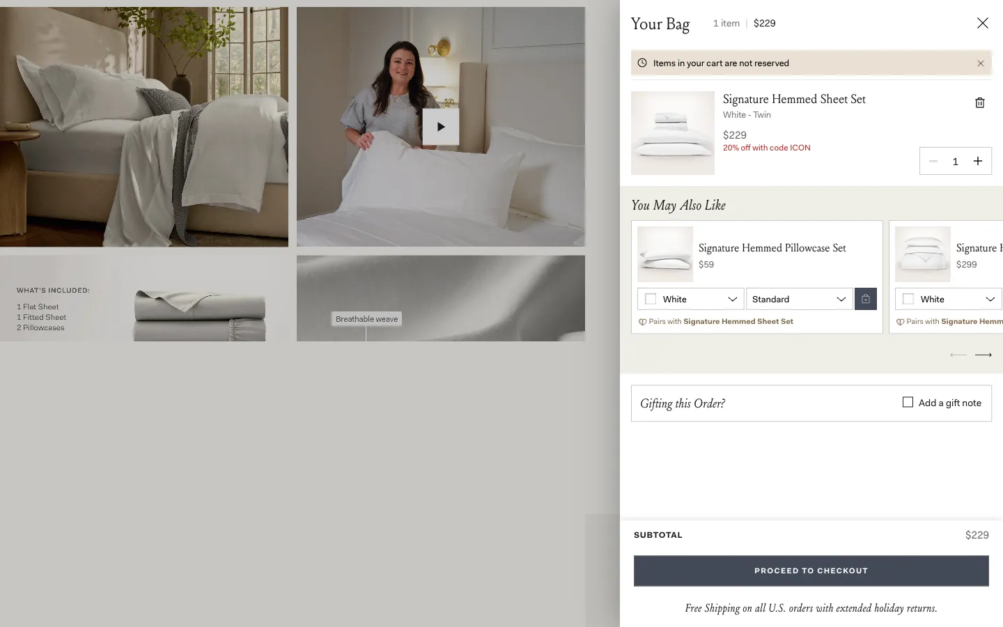
Under “You May Also Like”, Boll & Branch shows a Signature Hemmed Pillowcase Set ($59) with colour and size selectors, an add button and a small line reading “Pairs with Signature Hemmed Sheet Set”. The next card, another Signature Hemmed item ($299), carries the same kind of line.
The pairing line is the reason to look: it ties the suggestion to a named product in the same collection. Baymard recommends labels that define the context of a suggestion, and this one does it on the card itself rather than in a generic heading. Showing the selectors in the card keeps the choice of colour and size in the cart.
4. Allbirds: put the size and colour choice inside the suggestion
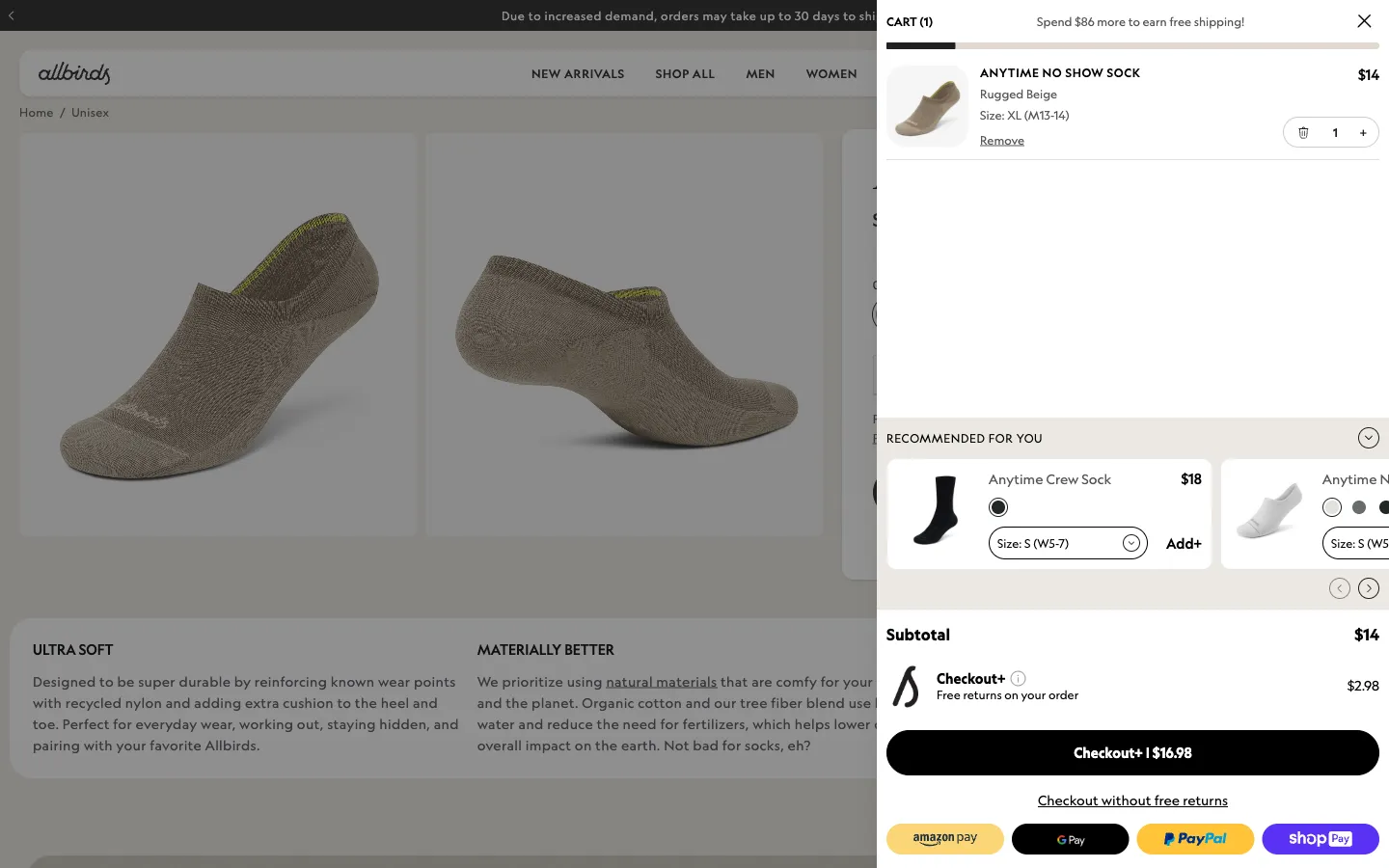
Allbirds’ “Recommended for you” row shows an Anytime Crew Sock at $18 with a colour swatch, a size selector reading “Size: S (W5-7)” and an “Add+” control. The next card, an Anytime no-show style, has its own swatches and size menu, with arrows to move through the row. The subtotal below reads $14.
For apparel, the main obstacle to adding is usually “which size?”. Building the colour and size choice into the card lets the shopper finish the decision where they are, with one control to add. The row sits above the subtotal, so the suggestion appears just before the total rather than competing with it.
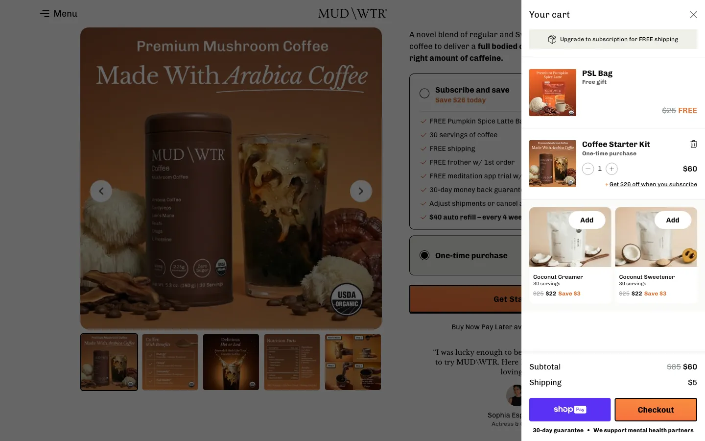
5. MUD\WTR: pair the add-ons by what they do, and show the saving on the card
MUD\WTR’s cart holds a Coffee Starter Kit ($60, shown against $85) with a “Get $26 off when you subscribe” link. Below it, two cards offer Coconut Creamer and Coconut Sweetener, each labelled with 30 servings, a struck-through $25, a $22 price and “Save $3”, with a rounded Add button on the picture.
A creamer and a sweetener are natural companions to a coffee alternative, and the pack shots make clear what they are. The serving count makes the size of each pack comparable with the kit’s, and the saving appears on the card instead of in a separate banner, so the shopper sees the whole offer where they decide.
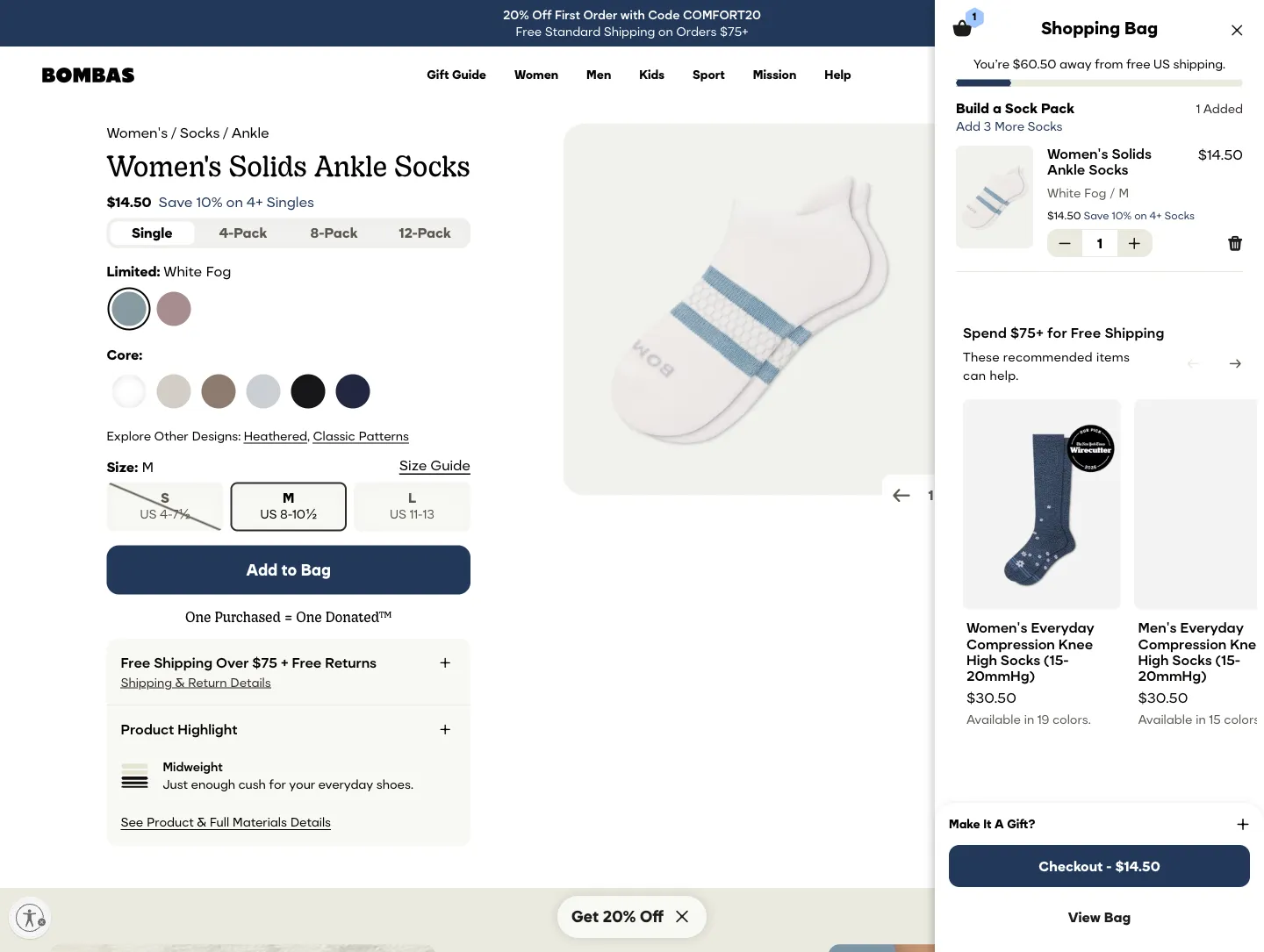
6. Bombas: link the suggestions to the shopper’s next goal
Above a row of socks, Bombas’ cart carries the heading “Spend $75+ for Free Shipping” and the line “These recommended items can help.” Women’s and Men’s Everyday Compression Knee High Socks sit in a carousel at $30.50 each, with “Available in 19 colors” and “Available in 15 colors” beneath. A Wirecutter badge appears on the first pair’s image.
The sentence connects the suggestions to something the shopper may already want, which is free shipping, so the products read as a way to get there instead of an unrelated sale. Naming the number of colours signals that a choice is still open without adding selectors to the card, and the badge gives the first product a proof point beside its price.
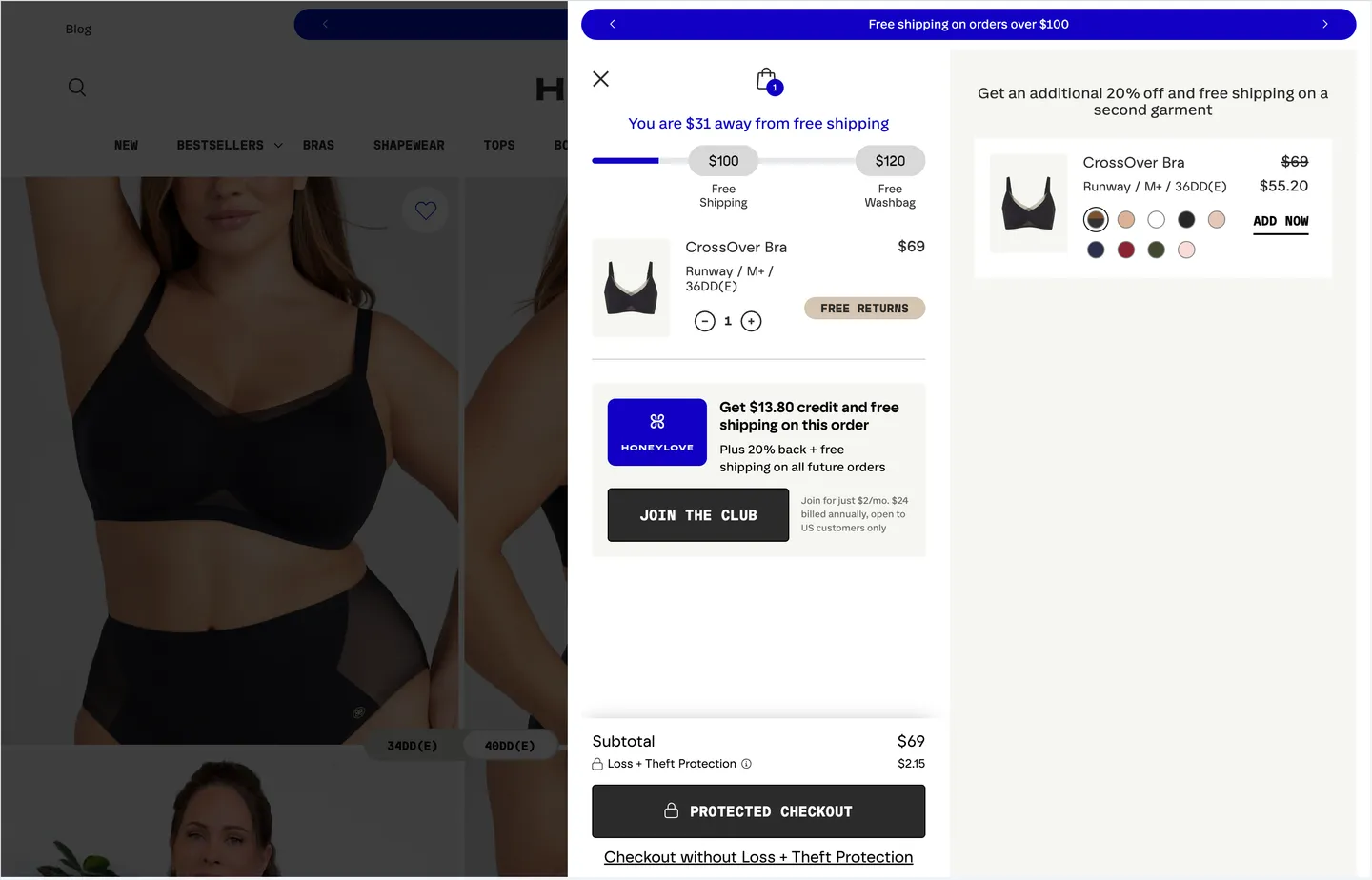
7. Honeylove: make a second item easy to price and easy to add
Under a “Free shipping on orders over $100” banner, Honeylove offers “an additional 20% off and free shipping on a second garment”. A CrossOver Bra in Runway, M+ / 36DD(E) shows $69 struck through and $55.20, with nine colour swatches and an “ADD NOW” link.
The offer states the reward and the condition in one sentence, and the card shows the reduced price already worked out ($55.20), so there is no arithmetic for the shopper to do. A specific style and size are named, and the swatches let the shopper change colour without leaving the cart. The banner above frames the cart as one where more is rewarded.
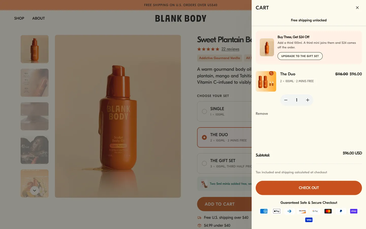
8. Blank Body Beauty: spell out what the next tier adds
Beneath a “Free shipping unlocked” line, Blank Body Beauty’s cart shows a card titled “Buy Three, Get $24 Off”: “Add a third 100ml. A third mini joins them and $24 comes off the order.” A button reads “Upgrade to the gift set”. The item below, The Duo, shows $116.00 struck through and $96.00, with “2 × 100ML · 2 MINIS FREE”.
The card does the arithmetic in words: what to add, what is included and what comes off. It sits directly above the product it builds on, so the tier reads as a step up from the Duo already in the bag. The button says “Upgrade”, which names the action as moving to a bigger set, not as adding a random product.
9. Hismile: say plainly when an upgrade replaces an item
Hismile’s “Upgrade and Save” block shows “Get 2 for €24.99”, valued at €39.98, with the line “Enjoy an instant saving of over 37%* when you buy two bottles in this bundle” and an Add to Cart button. Small print beneath says the offer will replace one iD Mouthwash item currently in the cart and that the discount is based on a full-price purchase of two bottles.
An upgrade is a different kind of add-on, because the shopper trades their current item for a bigger one. The tag, the bundle price and the original value are clear at a glance, and the small print states what will change in the cart before the button is pressed. That detail keeps the offer predictable, which matters when the basket changes after a click.
10. PetLab Co.: let the shopper claim the deal, and keep it separate from the subscription
PetLab Co.’s cart shows a free gift (Wild Caught Salmon Bites, $6.95 shown as Free) with a ticked “Claimed” box. Beneath it, a “Deal Unlocked – Get 50% Off” card for Dental Sticks (One time purchase) shows $19.90 struck through and $9.95, with an unticked “Claim Deal” box. An “Exclusive Deals” heading follows, with the line “This is a one-time purchase and won’t be added to your subscription.”
A tick box turns the offer into a choice the shopper makes, so the cart stays as the shopper arranged it unless they claim the deal. Showing the free gift as already claimed makes the unlocked deal below it easy to understand. The one-time-purchase note answers a question subscription shoppers are likely to have: will this repeat?
From examples to a test
Start by looking at your own cart. Which suggestions do shoppers see, are they related to what is in the basket, and does adding one take one step or several? Review a handful of real baskets, including a one-item basket, a basket near any shipping threshold and a basket with a subscription, before changing anything.
If you test a change, such as adding options to the card or a reason line, pick a primary outcome that matches the mechanism. Attachment rate and average order value show whether more is being added. Completed orders and revenue per visitor show whether the checkout path is still healthy, so track them as guardrails. A larger basket among fewer completed orders is not an improvement. For subscription carts, follow cancellations and renewals later, because a first-session result says little about lifetime value. Baymard’s research is a reason to be careful about relevance, not evidence that any one layout wins.
To browse more cart upsells across the library, see the cart upsell element library. To look at what happens before the cart, read 15 ecommerce product page design examples.
 Wild One
 Casper Sleep
 Boll & Branch
 Allbirds
 MUD\WTR
 Bombas
 Honeylove
 Blank Body Beauty
 Hismile
 PetLab Co.