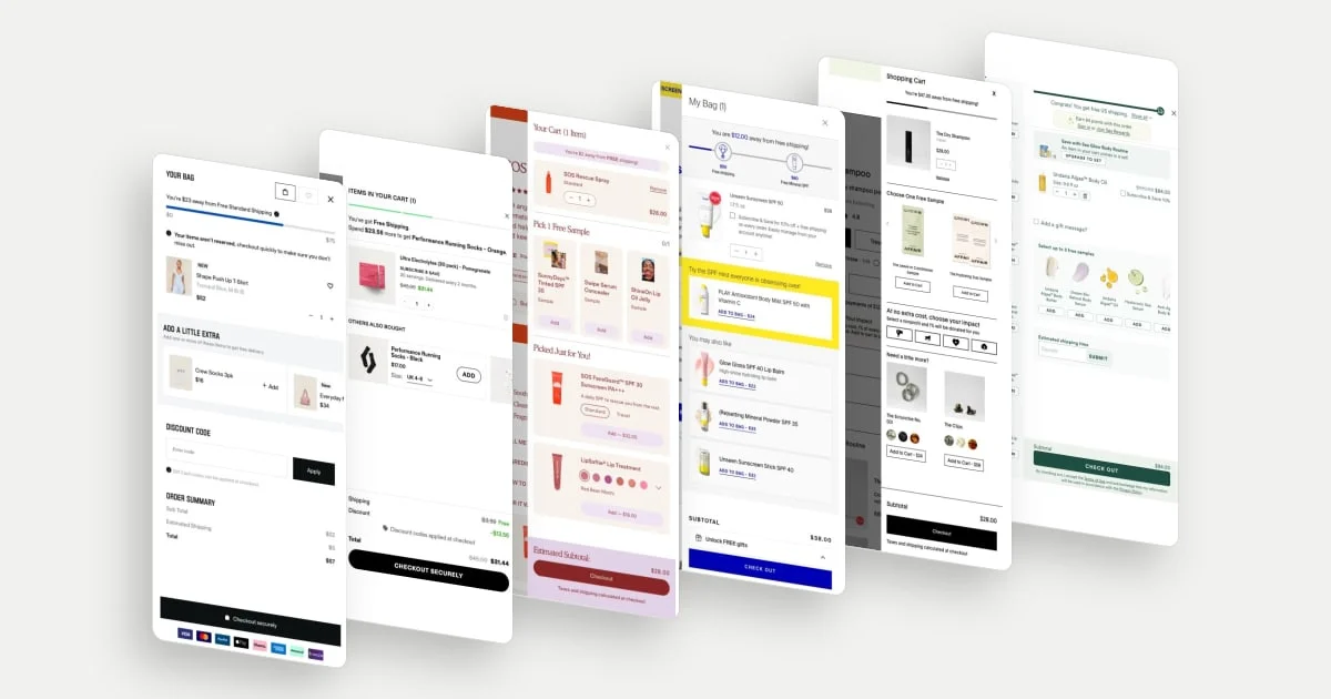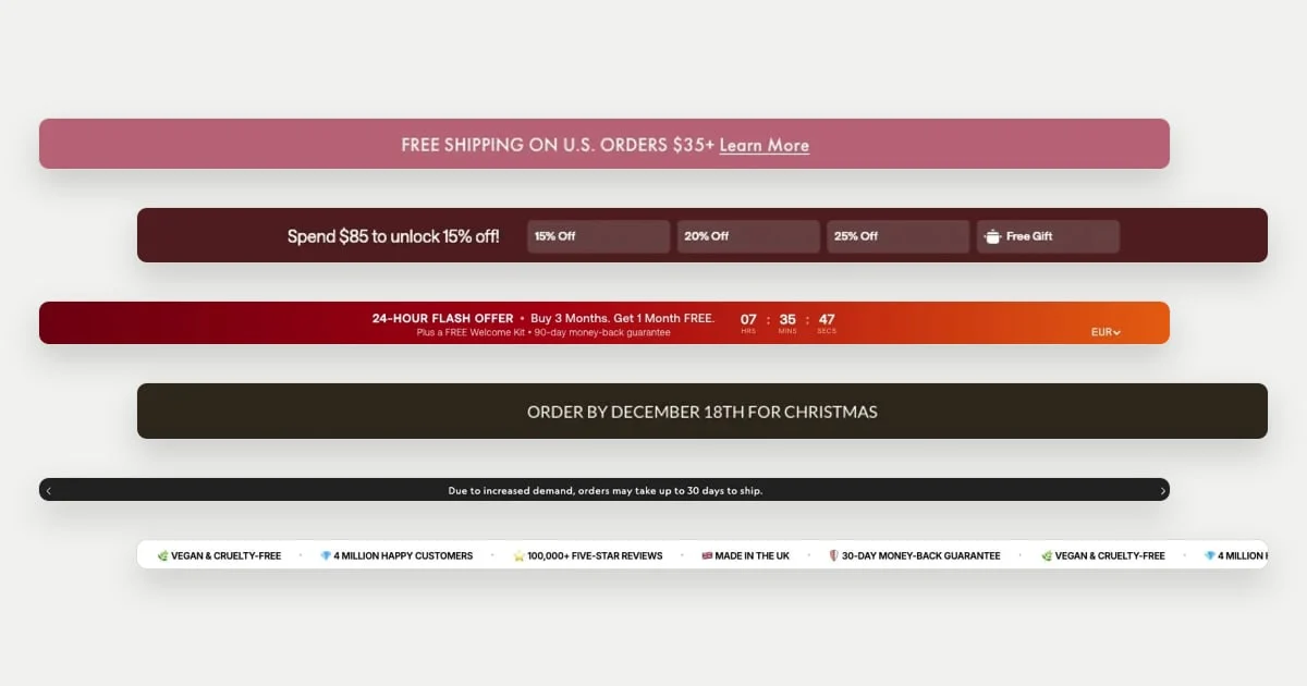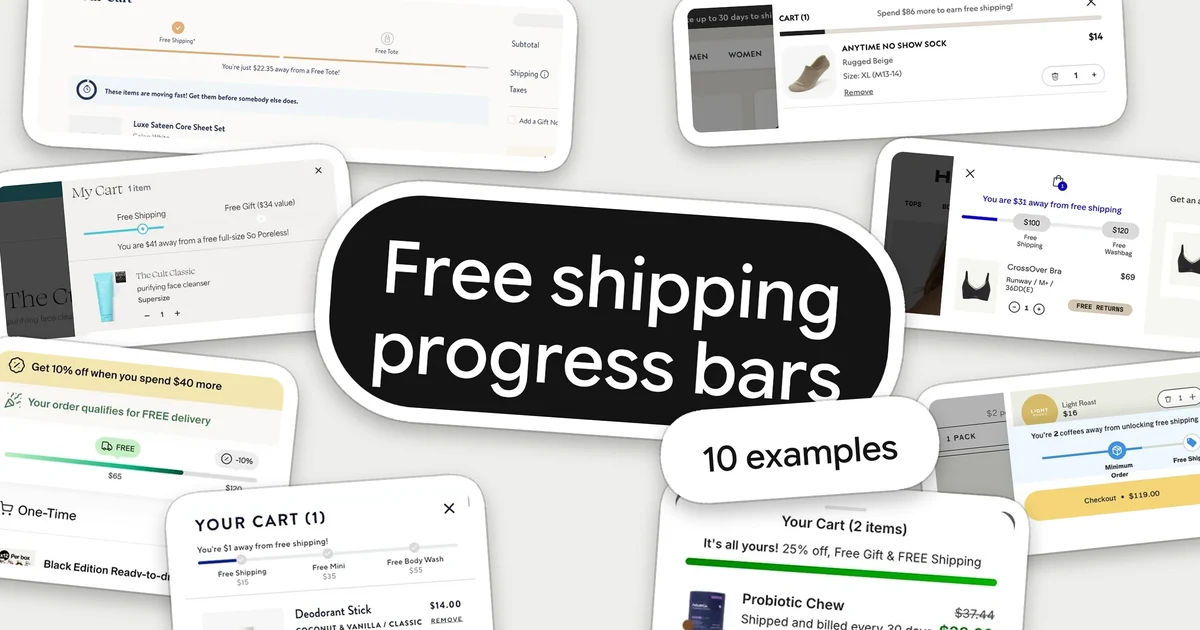
A free shipping progress bar is a small meter in the cart that shows how much more a shopper has to spend to qualify for free delivery. It answers a question the shopper may already have: what will this cost to get to me, and is there a cheaper way to finish the order?
These ten ecommerce free shipping progress bar examples were selected for ten different choices: how the remaining amount is worded, where the bar sits, how milestones are labelled, what happens once shipping is unlocked and what a store adds beyond shipping. “Best” is not a claim about conversion: we do not have order data for any of these stores. The screenshots are single populated cart states captured between September and November 2026. We did not add or remove items to watch the bars update, and thresholds are only quoted where they are readable in the picture. For the wider drawer layout around these bars, see our cart drawer examples. The same pattern is catalogued on the free shipping progress bar element page.
Why the bar belongs in the cart
Baymard’s cart abandonment list, updated 28 October 2026, reports that among US online shoppers who did not abandon a cart simply because they were browsing, the top reasons were extra costs being too high (40%), slow delivery (20%) and not trusting the site with card details (19%). See the Baymard figures. That supports showing delivery cost early; it does not show that a bar raises orders or order value.
A bar can do three separate jobs, and the examples below show each one:
- State the goal. Say what is being offered and how far away it is.
- Show progress. Make the gap visible without a calculation.
- Confirm the result. When the shopper qualifies, say so, and decide whether there is a next reward.
10 ecommerce free shipping progress bar examples
1. Allbirds: put the remaining amount first
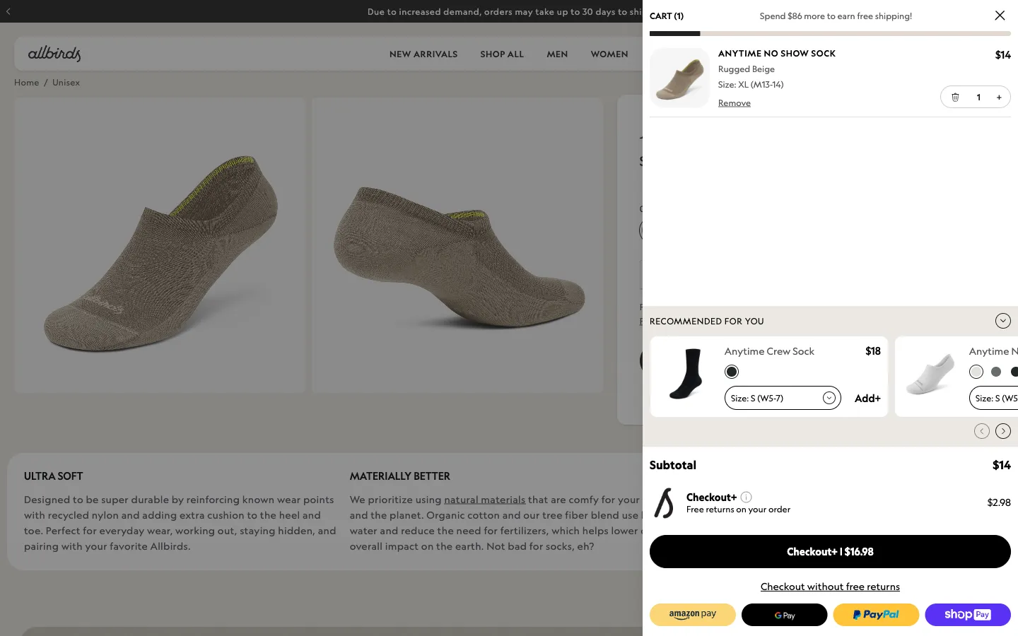
Allbirds places a single sentence, “Spend $86 more to earn free shipping!”, in the top row of the drawer, with a thin bar attached directly under the header. The shopper meets the shipping message before the product list, and the number is already worked out from the basket instead of leaving them to subtract.
The verb helps: “earn” frames free shipping as something that comes with the order. The bar stays quiet in the visual hierarchy, so the product row still leads.
2. Glossier: name which shipping is free
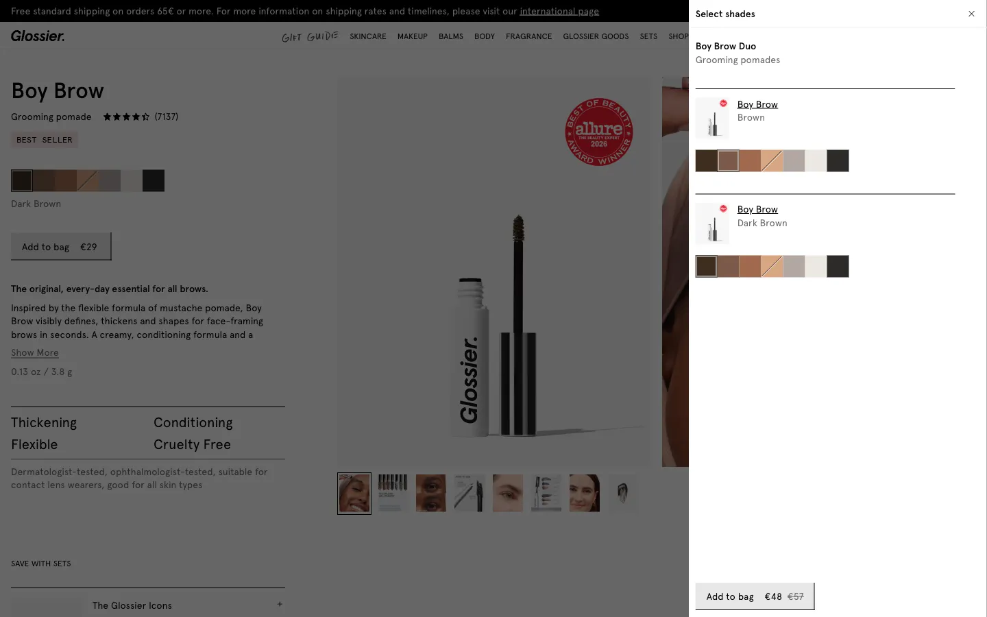
Glossier puts the message and a short bar on one line: “€18 away from free standard shipping”. The text sits on the left and the bar to its right, so the first product stays visible on a small screen.
“Standard” tells the shopper which delivery option the reward applies to. That small word answers the follow-up question about whether faster delivery is also free, without adding a line of explanation.
3. Honeylove: print the milestone values on the track
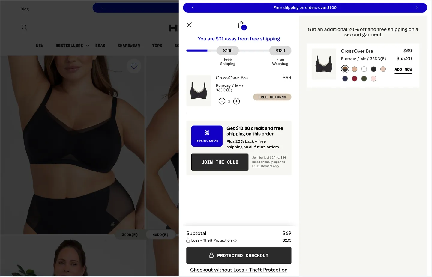
Honeylove writes “You are $31 away from free shipping” above a track labelled $100 for free shipping and $120 for a free washbag. A strip at the top of the drawer repeats “Free shipping on orders over $100”.
The values on the track let the shopper see the goal and the next one beyond it in one glance. Repeating the same threshold in the strip means the drawer matches the message that brought them to the store.
4. Vuori: confirm the reward as a status
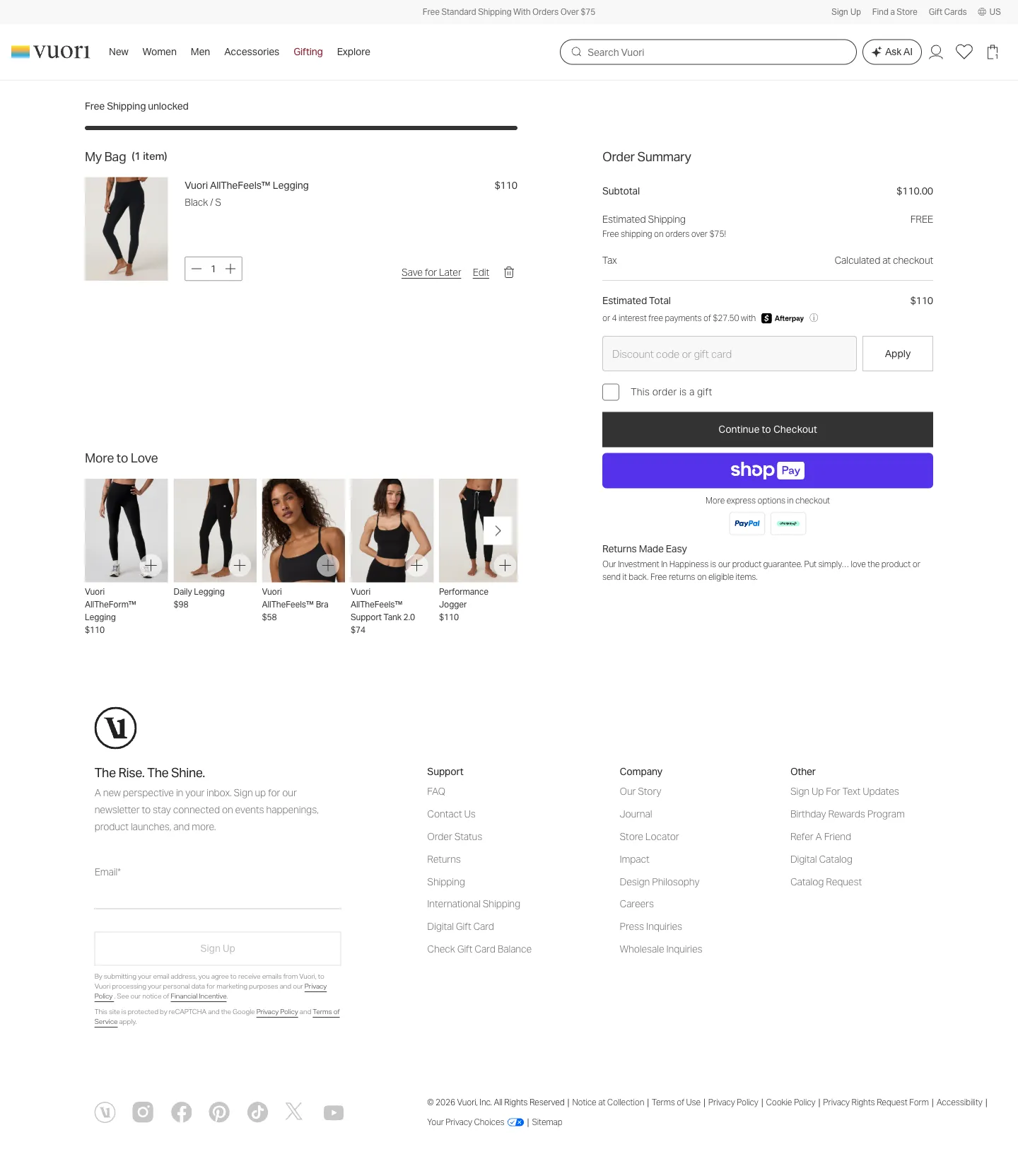
Vuori shows the earned state on the cart page: a full bar labelled “Free Shipping unlocked” above “My Bag”, with the site-wide strip above it stating free standard shipping on orders over $75. The bar reads as a confirmation, not a prompt.
Because the bag already holds a $110 item, the shopper sees the benefit applied before reaching the order summary. The completed bar is also a stable place to return to if they change quantities.
5. Huel: hand off to the next reward
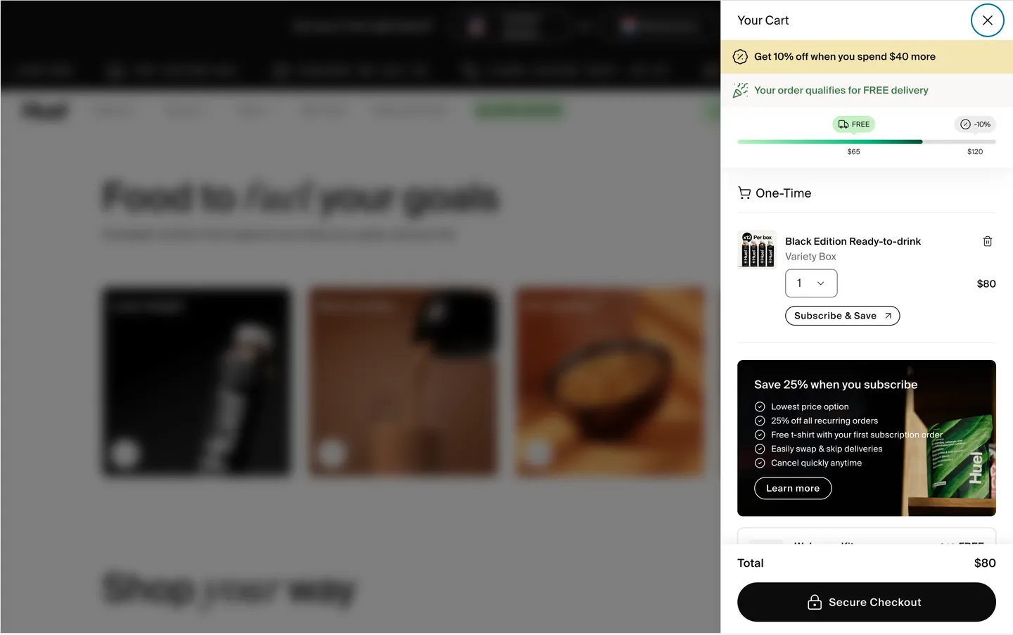
Huel uses one green track with a FREE marker at $65 and a −10% marker at $120. Two lines of copy sit above it: “Get 10% off when you spend $40 more” and “Your order qualifies for FREE delivery”.
Once free delivery is secured, the bar does not stop. It keeps pointing to the next reward, and the two messages separate what the shopper has from what they could still get.
6. Brooklinen: give each reward its own segment
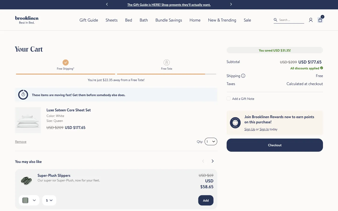
Brooklinen splits the meter into two equal segments, each with an icon and a label: Free Shipping with a check mark, and Free Tote with a gift icon. The message, “You’re just $22.35 away from a Free Tote!”, talks about the reward the shopper has not yet reached.
Separate segments make the state of each reward readable at a glance: one is done, the other almost done. The check mark does the work that a sentence would otherwise have to do.
7. TULA: name the reward and its value
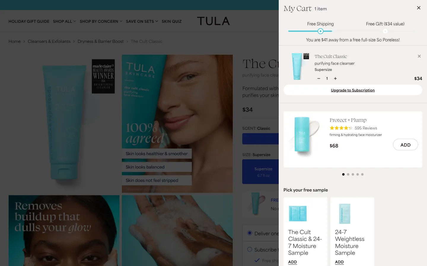
TULA labels its two milestones “Free Shipping” and “Free Gift ($34 value)” and writes the message around the product: “You are $41 away from a free full-size So Poreless!”
Naming the exact item, and attaching a value to it, makes the reward concrete. A shopper deciding whether to add one more product can compare the cost of the gap against something specific.
8. Native: build a ladder of small rewards
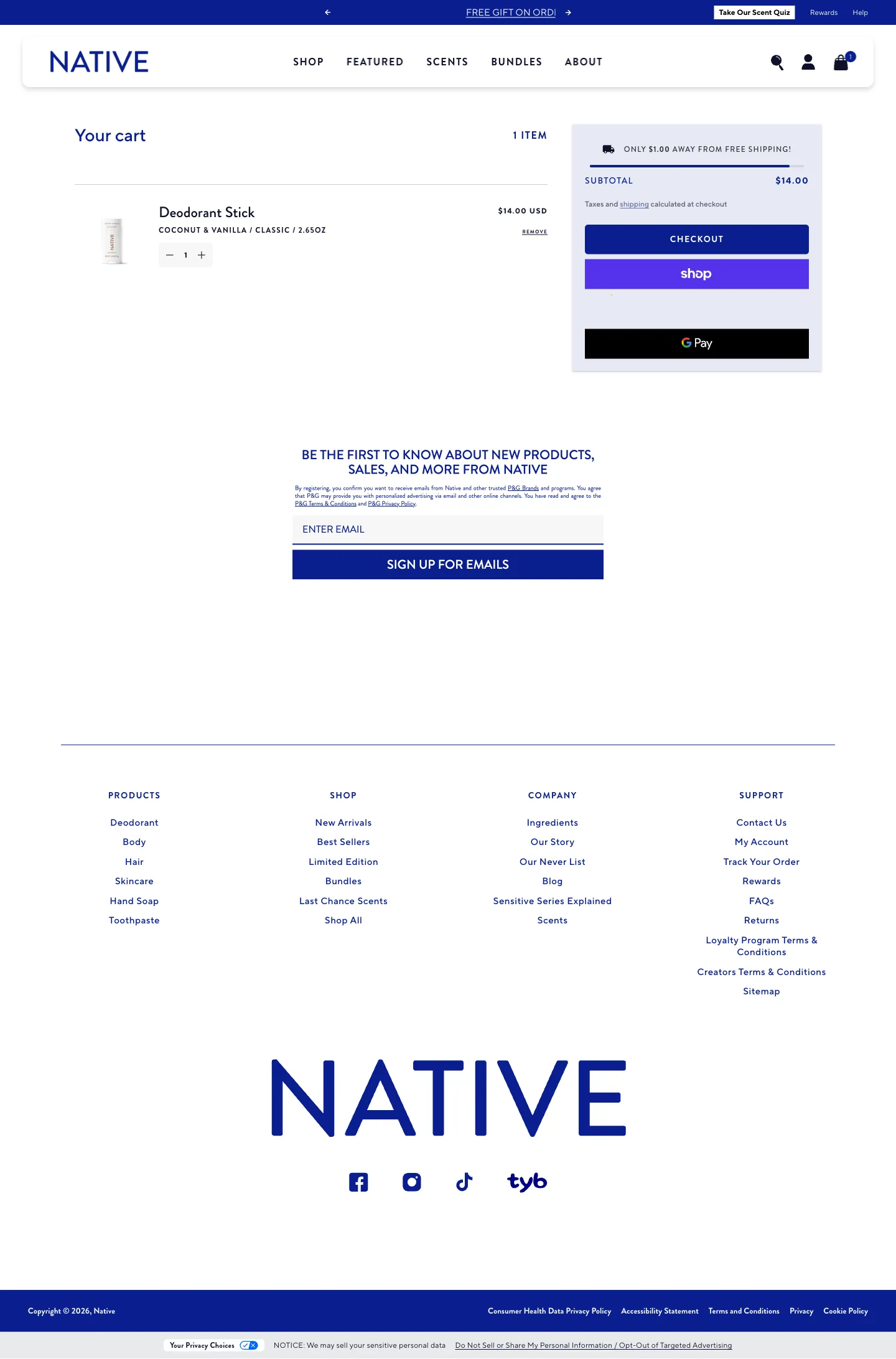
Native puts three milestones on a single bar: Free Shipping at $15, Free Mini at $35 and Free Body Wash at $55. With a $14 deodorant in the cart, the message reads “You’re $1 away from free shipping!”.
The ladder is scaled to the price of the product. With low-priced items, the first reward is within reach of a single add-on, and the later steps give the shopper reasons to keep going.
9. Cometeer: count progress in the product’s own unit
Cometeer says “You’re 2 coffees away from unlocking free shipping” and draws two milestones on the bar: Minimum Order, already reached, and Free Shipping. The bar sits directly above the checkout button.
Counting in coffees, not dollars, turns a spend target into a basket-building task the shopper already understands. Placing it next to the checkout button keeps it in view at the moment of decision.
10. PetLab Co.: summarise everything earned
PetLab Co. fills the bar in solid green and says “It’s all yours! 25% off, Free Gift & FREE Shipping” above the cart items.
When several rewards are active, one confirming line saves the shopper from checking each milestone. The full bar and the short sentence make the end state feel complete.
Test a shipping bar on your own store
Start from your own evidence: the distribution of order values, how many baskets sit just below the threshold, shipping cost per order and margin. If many baskets cluster below the threshold, a bar may help shoppers see the gap. If the threshold sits far above most baskets, a bar may only highlight the distance.
When testing, measure completed orders and revenue or contribution per visitor, not just average order value. Watch conversion rate, shipping cost and returns as guardrails, and check the bar on small screens, when quantities change and when the cart is empty. No result here predicts an uplift for your store.
To keep exploring, browse the cart pages in the library, or read how stores put the bar into a full drawer in our cart drawer examples and repeat the offer in the announcement bar examples.
 Allbirds
 Glossier
 Honeylove
 Vuori
 Huel
 Brooklinen
 TULA
 Native
 Cometeer
 PetLab Co.