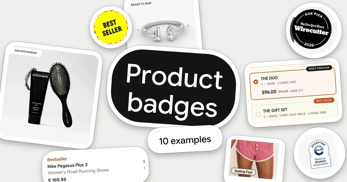
A product badge is a small label attached to a product card or option: “Bestseller”, “New”, an award seal, “Ready to ship”. Its job is to answer one question while a shopper is scanning, before they open the product. Which one is popular? What is new? Who else vouches for it? Will it arrive in time?
These ten ecommerce product badge examples were chosen because each answers a different question in a different visual way: plain text, a pill, a sticker, a seal, a tab on an option. The screenshots date from September to November 2026 and show a single desktop or mobile state each. We did not test how the badges are triggered, how they change by market or whether they affect sales, so none of this claims a result. It is a close reading of what each store makes visible.
What a badge can say
Most badges fall into five groups, and the examples below cover all of them:
- Popularity: “Bestseller”, “Selling Fast”, “Most popular”.
- Newness: “New”, “New Color”, “Just In”.
- Outside proof: a press pick, an award or a certification from a named body.
- Offer or campaign: “Holiday Exclusive”, “Save with bundles”.
- Readiness and options: “Ready to ship”, or a tag that steers someone between sizes of a set.
What the research says to keep in mind
Baymard Institute's guide to badges in ecommerce (published 23 September 2026) makes three points worth holding onto while you read. Use a badge only when it signals a meaningful difference that would change what a shopper does. Keep badges rare, because if most products carry one they stop standing out. And keep the wording short, concrete and self-explanatory, since shoppers read badges while scanning. It also notes that urgency labels such as “Low stock” should appear only when the stock situation is real. Read Baymard's badge guidance.
That is design guidance, not proof that any badge below lifted sales. Use it as a lens: for each example, ask what the label tells a shopper that the card does not already say.
10 ecommerce product badge examples
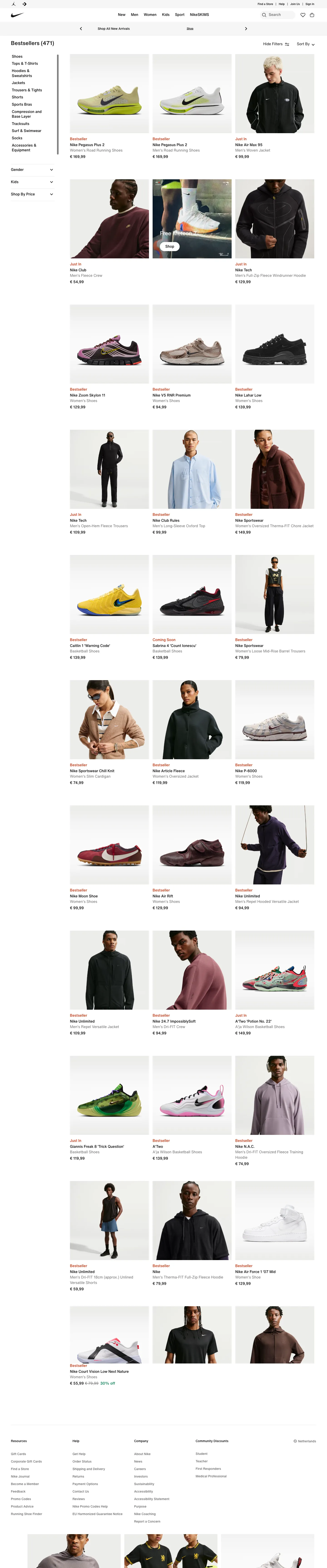
1. Nike: put the label in the reading line
Nike's listing puts “Bestseller” and “Just In” as orange-red text between the photo and the product name, in a size close to the product name. There is no box, sticker or overlay on the photography, so the photos stay clean and the status is the first line a shopper reads as they drop their eyes to the card.
The colour does the signalling. The two labels share one accent colour that appears nowhere else on the card, so the eye can find them in a dense grid without them competing with the product image. Two words, one position, one colour: the label is understood before it is read.
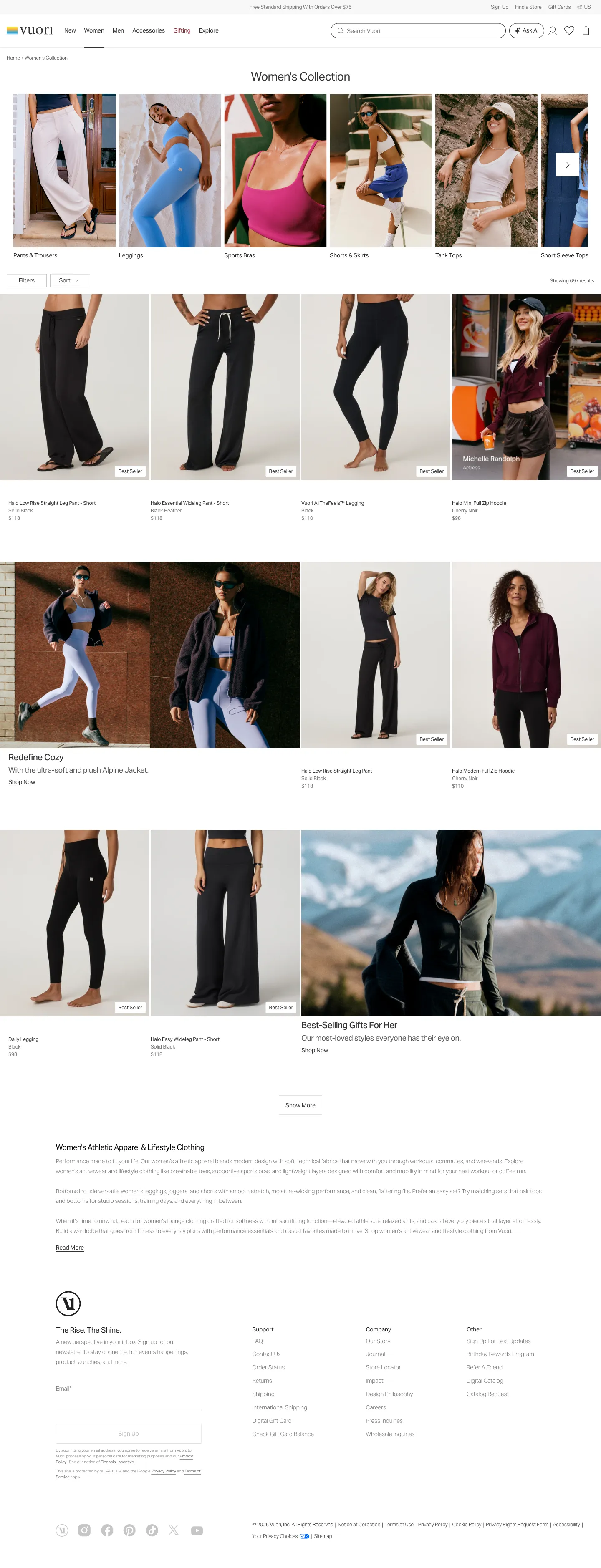
2. Vuori: a consistent pill in the photo corner
Vuori places a white “Best Seller” pill in the bottom corner of the photo. Because the position is fixed, shoppers learn where to look after the first row, and the white pill with dark text stays readable over the pale grey studio backgrounds.
The label sits on the image rather than in the text block, which keeps the product name, colour and price lines uniform and easy to compare down the grid. The pill answers “which of these do others choose?” without changing the layout of the card underneath.
3. Fly By Jing: a sticker that matches the packaging
On Fly By Jing's listing, a yellow starburst marked “Best Seller” overlaps the top of the Original Sichuan Chili Crisp jar. The yellow echoes the lettering on the jars themselves, and the slightly tilted, sticker-like shape feels like part of the packaging rather than a store-added label.
On a bold red section with colourful jars, a small rectangular tag could vanish. A shaped, bright sticker is visible at once and gives a first-time visitor a starting point among several flavours: the product with the sticker is the one to try first.
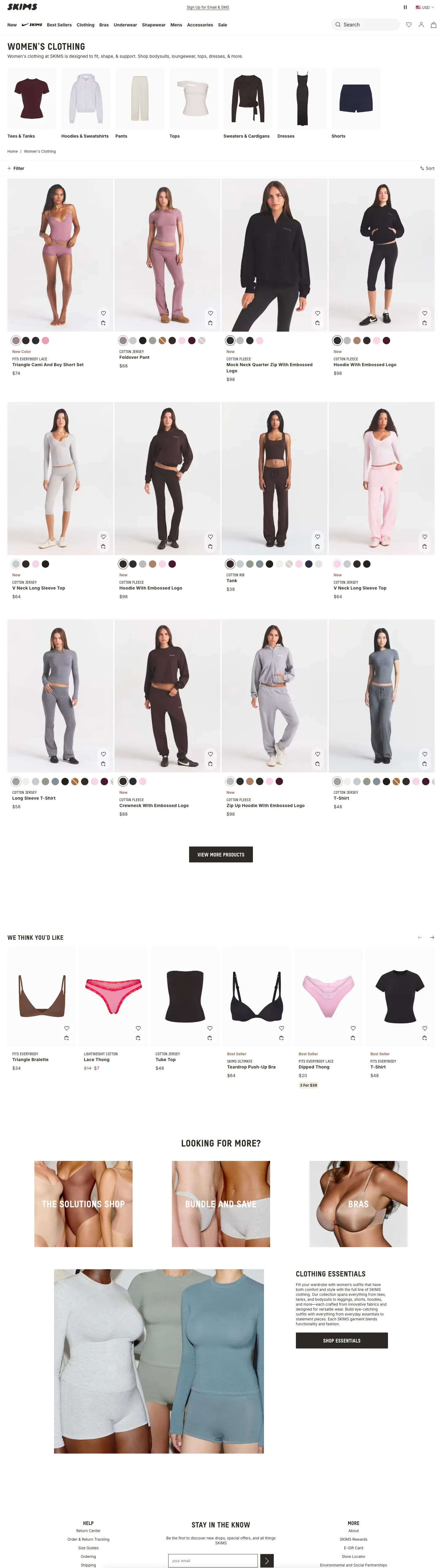
4. SKIMS: separate “New” from “New Color”
SKIMS uses two related labels in a muted brown above the product name: “New Color” on the Triangle Cami and Boy Short Set, and “New” on the Mock Neck Quarter Zip. The difference matters to a returning shopper, who can tell a familiar style in a fresh colourway from a brand-new product. The Foldover Pant between them carries no label, so the labels mark the cards that have news.
The brown matches the store's neutral palette, so the labels read as part of the brand rather than as a promotion, and the colour swatches sit directly above, so a shopper looking at a “New Color” card can see the colour options in the same glance.
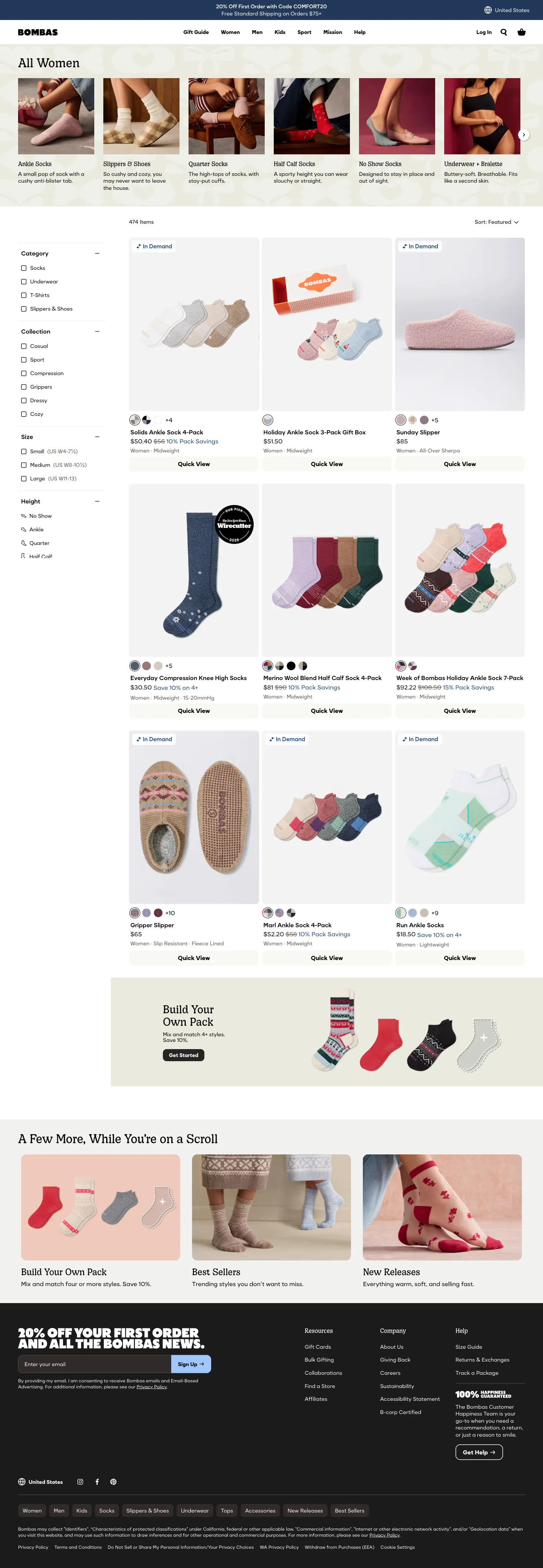
5. Bombas: name the outside reviewer and the year
On Bombas's listing, a black circular seal reading “Our Pick, The New York Times Wirecutter, 2026” sits on the corner of the product photo. Naming the publication answers the question every third-party badge raises: who says so? Adding the year shows the recommendation is current.
The seal is large enough to read on a listing page, so the endorsement reaches shoppers who never open the product, and it sits beside the product rather than over it.
6. Glossier: a certification tied to one concern
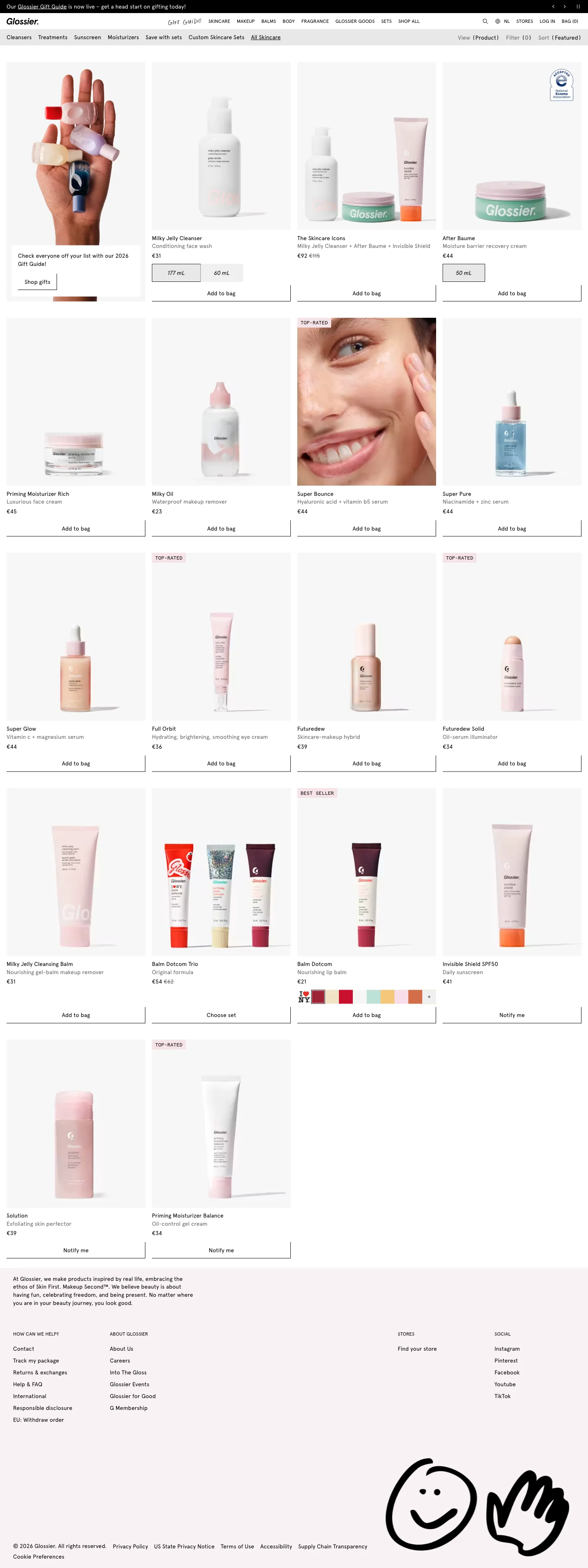
In this view of Glossier's skincare listing, the After Baume card carries a National Eczema Association “Accepted” seal in the top-right of the photo, while the neighbouring cards do not. A certification from a recognised body speaks to a specific concern, sensitive or reactive skin, and the badge appears only where it applies.
That precision is what makes it useful: a shopper with that concern can spot the relevant product while scanning, and everyone else sees an uncluttered grid.
7. Crown Affair: say why a set is special
On Crown Affair's collection page, two white labels, “Save with bundles” and “Holiday Exclusive”, sit in the top-left of the set photos. Each explains why that set is worth a look: one points to the saving, the other to a seasonal edition. The Add to Cart button above each set shows the old and new price, so the label and the price support one another.
The labels are quiet in style, white with small capitals, and carry meaning through words. That suits a premium look while still giving the offer a name.
8. VRAI: label readiness, not popularity
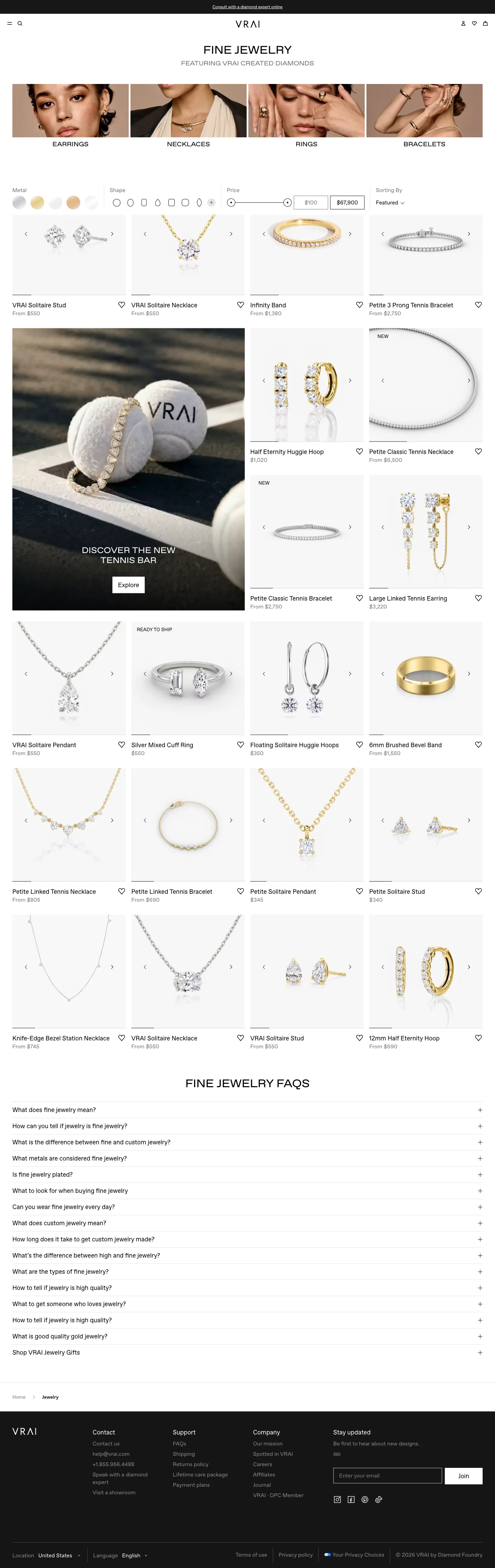
On VRAI's listing, “Ready to ship” appears in small capitals at the top-left of the Silver Mixed Cuff Ring card. It is a status label, not a popularity claim. For a considered purchase such as jewellery, where timing can matter, a note on readiness answers a delivery question before the click.
The label is understated, with no fill, so it does not compete with the jewellery, and the cards around it in this view carry none, which keeps the label informative.
9. Knix: a momentum label in an outlined pill (mobile)
On Knix's product page, inside the “Our Best-Selling Underwear” carousel, the first product carries a “Selling Fast” pill. It is outlined rather than filled, a lighter touch that fits a small mobile card, and it adds momentum to a carousel already framed as best sellers.
On a narrow screen where each card shows only a little, a short two-word label is about the amount of text that fits and still reads at a glance.
10. Blank Body Beauty: use badges to guide pack choice (mobile)
Blank Body Beauty's set selector offers Single, The Duo and The Gift Set. “Most popular” is attached to the middle option, which is already selected, and “Best value” to the largest set, with the savings (17% and 31%) shown beside each price. Two different tabs carry two different meanings: popularity for the middle choice, value for the biggest.
Badging options rather than products helps when a shopper has already decided to buy and is working out how much. The labels give a quick answer to “which size do people choose?” and “which one saves the most?” without reading every line.
A test worth running
Observed problem: shoppers scroll a long grid and open products that don't fit their need, or hesitate between similar items.
Change: add one badge type to a limited set of products, driven by a clear rule such as top sellers by units over a fixed period. Keep the rest unbadged.
Primary outcome: completed purchases per visitor. Diagnostics: clicks on badged versus unbadged cards, product finding and add to cart. Guardrails: page speed, returns and discount cost. Look at the result by device, since badges take up more of a mobile card. Clicks on a badged card alone would not show that the badge helped, because it may move attention without changing purchases.
Keep exploring
For more labels in context, browse all product badge examples in the library. To see how badges sit in the wider listing and product-page experience, read our collection page examples and product page examples.
 Nike
 Vuori
 FLY BY JING
 SKIMS
 Bombas
 Glossier
 Crown Affair
 VRAI
 Knix
 Blank Body Beauty