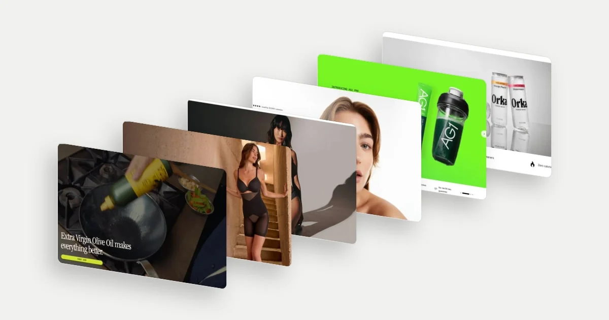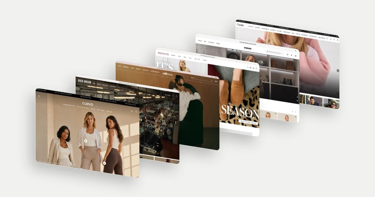
Fashion shoppers cannot try anything on. The homepage has to answer four questions in the first few screens: Will it feel right on me? Is this my kind of brand? What is right for now? Where do I start in a big range?
See all fashion ecommerce website design examples, or read on for how ten of them work.
These ten examples come from fashion, footwear and activewear stores in the library, grouped by the question each one answers best. They are desktop homepage captures from late September to early November 2026, so seasonal and holiday messages are as they were on those days. Every customer count and claim is the brand's own, and we do not judge any product. This is about how the pages are put together.
What a fashion homepage has to do
| Job | The shopper's question | Seen here |
|---|---|---|
| Fit and comfort | Will it feel right on me? | CURVD., Allbirds |
| Story and craft | Is this my kind of brand? | Buck Mason, Odd Muse, Wandé Esan |
| The moment | What is right for now? | Rothy's, Gymshark, Comfrt |
| A big range | Where do I start? | On, Nike |
Two pieces of research help explain the choices. Baymard's apparel research found that uncertainty about sizing was a common reason to abandon a product, and its benchmark found that 83% of desktop apparel sites (and 87% of mobile) do not provide sufficient sizing information. That research is about product pages (2022), not homepages. The homepage examples below show how some stores bring fit and comfort forward before the shopper reaches a product, by leading with how the clothes feel.
Baymard's homepage and navigation research (updated October 2026) describes the homepage as the anchor for a site's category structure and reports that 61% of desktop sites in its benchmark of 180+ top ecommerce sites perform "mediocre" to "poor". Neither source shows that any page below converts better.
Lead with comfort and ease
1. CURVD.: let the product images carry the specifications
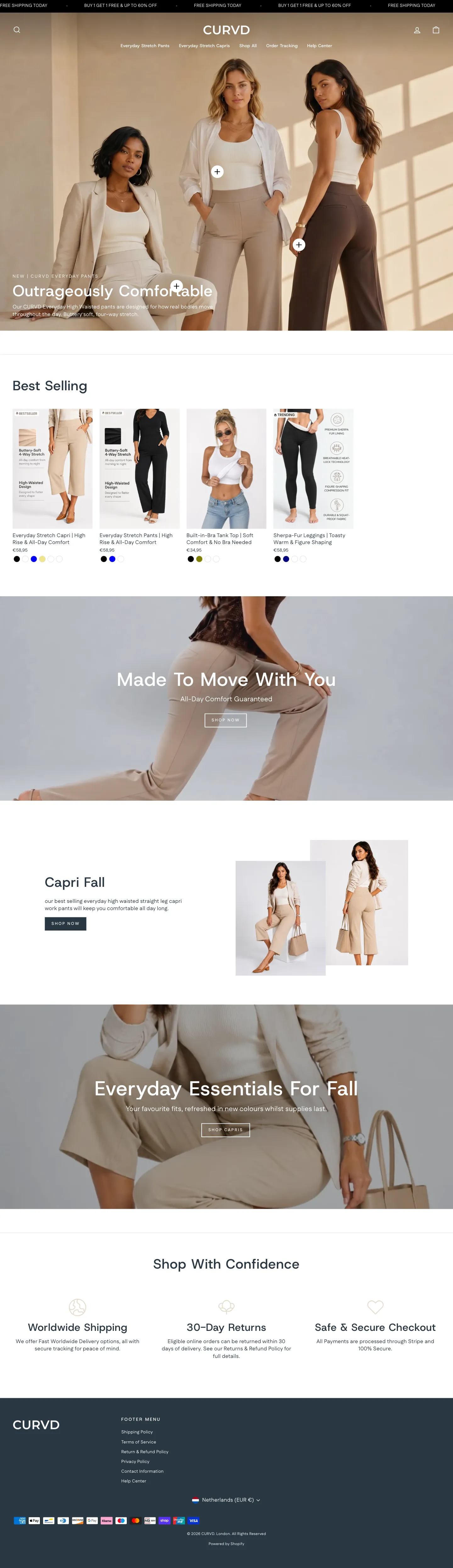
CURVD. opens with three people in neutral clothing under the headline "Outrageously Comfortable", with a line about pants "designed for how real bodies move throughout the day" and "buttery soft, four-way stretch" (the brand's own description). Two small plus markers sit on the models; they look like shoppable hotspots, though we did not test them. In the "Best Selling" row, product titles name the benefit, for example "Everyday Stretch Capri | High Rise & All-Day Comfort" and "Built-in-Bra Tank Top | Soft Comfort & No Bra Needed", and some product images carry call-outs such as "Buttery-Soft 4-Way Stretch" and "High-Waisted Design".
A shopper who cannot feel the fabric gets the specification and the benefit in the picture and the title before opening a product.
2. Allbirds: two words for the promise, routes in the hero
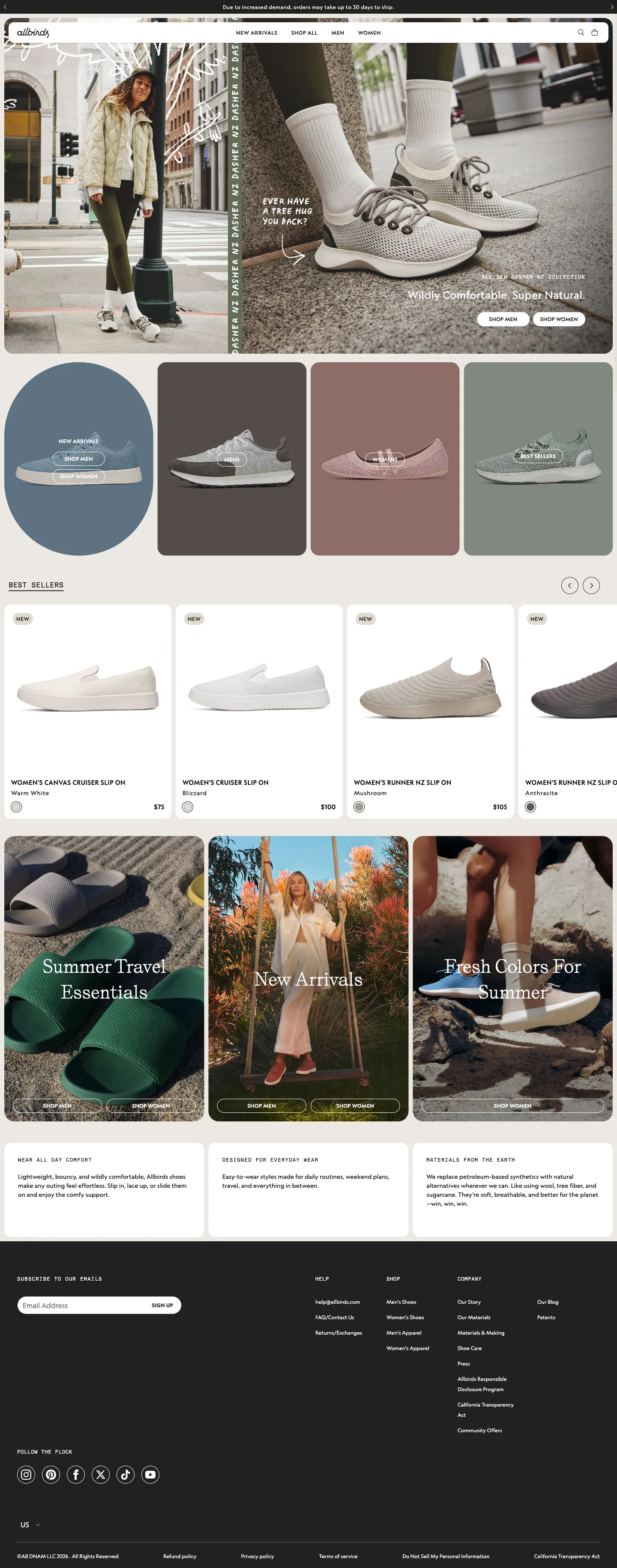
Allbirds' hero pairs a person in a quilted jacket with a close-up of a shoe. It reads "Ever have a tree hug you back?" and "Wildly Comfortable. Super Natural.", with "Shop Men" and "Shop Women" buttons inside the image. Below, collection tiles use colour blocks and different shapes, a circle for new arrivals and rectangles for the others, before a "Best Sellers" carousel in which each product is named with its colour and price, such as "Women's Runner NZ Slip On, Mushroom, $105".
The promise is short and concrete, the first click is gender, and each product shows its colourway so the shopper can choose without opening it.
Lead with craft and identity
3. Buck Mason: show how it is made, then make the look shoppable
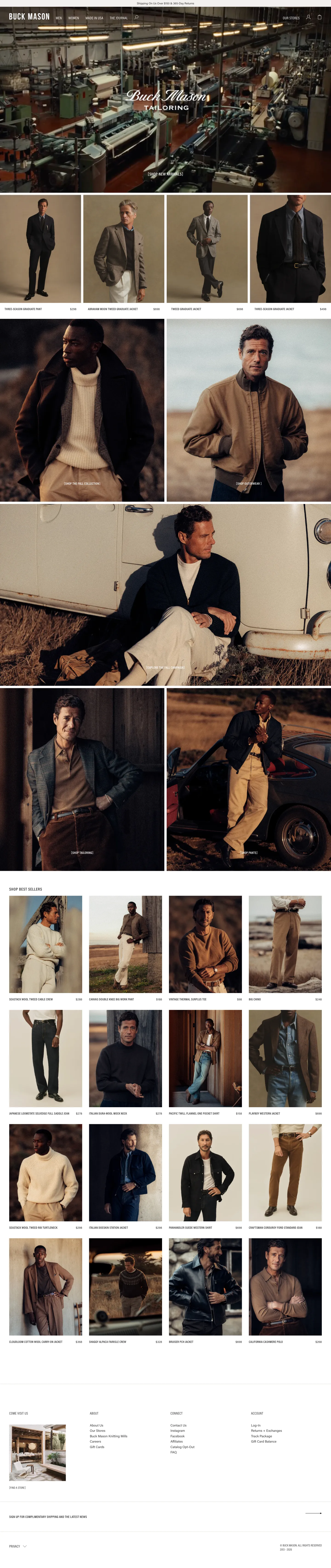
Buck Mason's hero is a film of what appears to be a textile mill, with "Buck Mason Tailoring" over it and a bracketed "[Shop new arrivals]" link. There is no model in the first frame. Directly below, four tailoring looks sit in a row with the product name and price under each, such as "Three-season graduate pant" at $298.
Craft is the proof, and the editorial photographs double as a product list.
4. Odd Muse: let the campaign offer two moods
Odd Muse's navigation includes "Bridal", "Curated" and "In Her World", and the hero, a campaign called "Out of town", offers two links: "Shop Party" and "Shop Chic". Under "All Eyes on You" a row of four dresses follows, with a "Discover the products" link, and black-and-white editorial images continue below.
The shopper picks a mood, not a category, so the campaign image is also a navigation choice.
5. Wandé Esan: make the whole page the brand
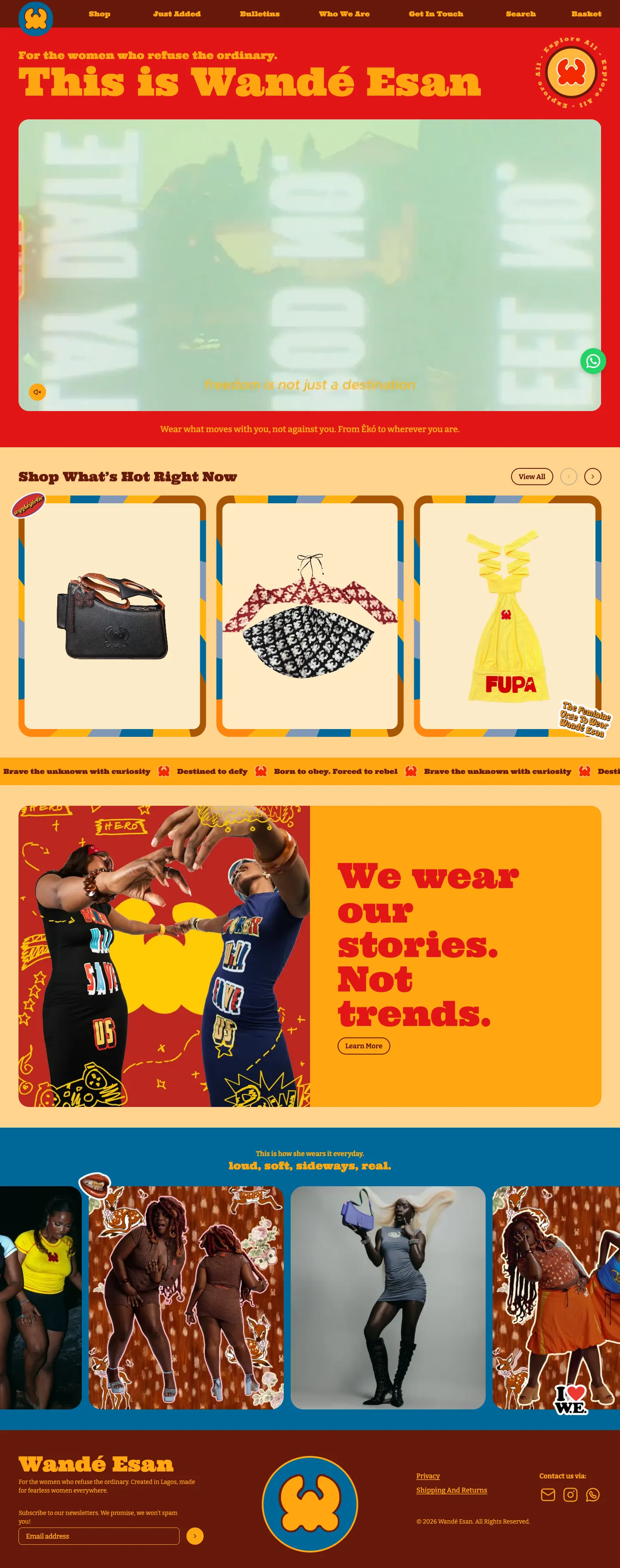
Wandé Esan uses colour and type as identity. A red and yellow page opens with "For the women who refuse the ordinary", a headline "This is Wandé Esan" and a video, followed by the line "Wear what moves with you, not against you." "Shop What's Hot Right Now" shows products in decorative frames, and a ticker runs brand lines: "Brave the unknown with curiosity", "Destined to defy" and "Born to obey. Forced to rebel".
A shopper looking for a brand with a point of view gets one before they see a single price.
Merchandise the moment
6. Rothy's: make the season the headline
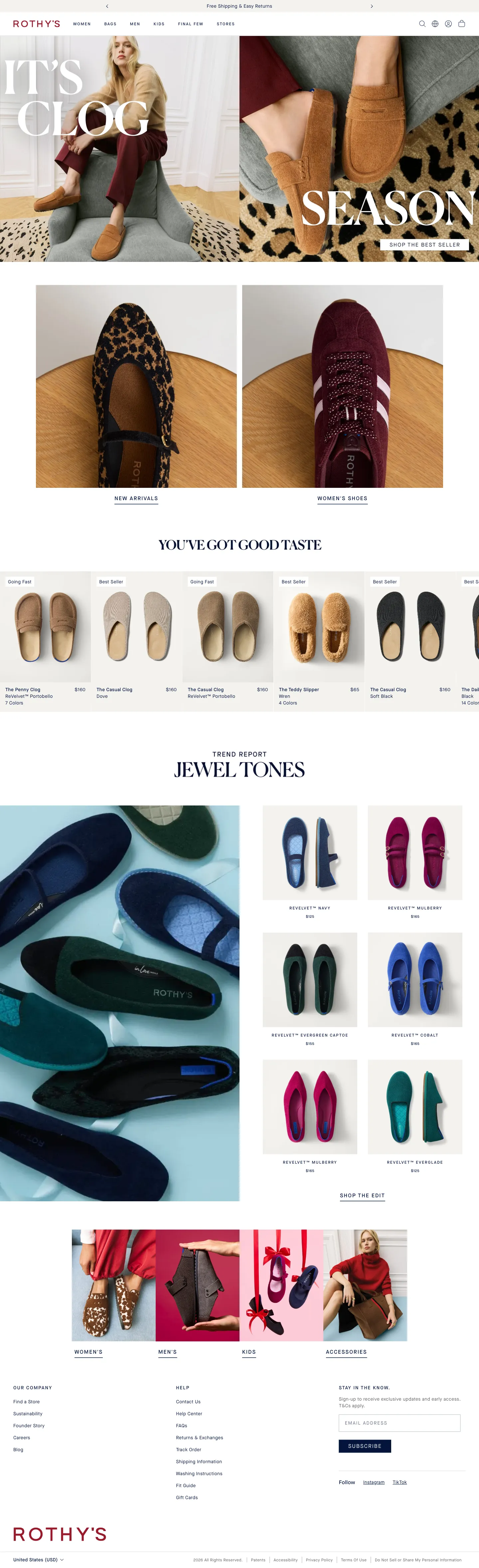
Rothy's runs "It's Clog Season" in large type across two photographs, with a single button, "Shop the best seller". Two image tiles below lead to "New arrivals" and "Women's shoes". A top bar carries "Free Shipping & Easy Returns".
The season is the idea, one button leads to a safe choice, and the next tiles give other ways in.
7. Gymshark: pair every campaign with its products
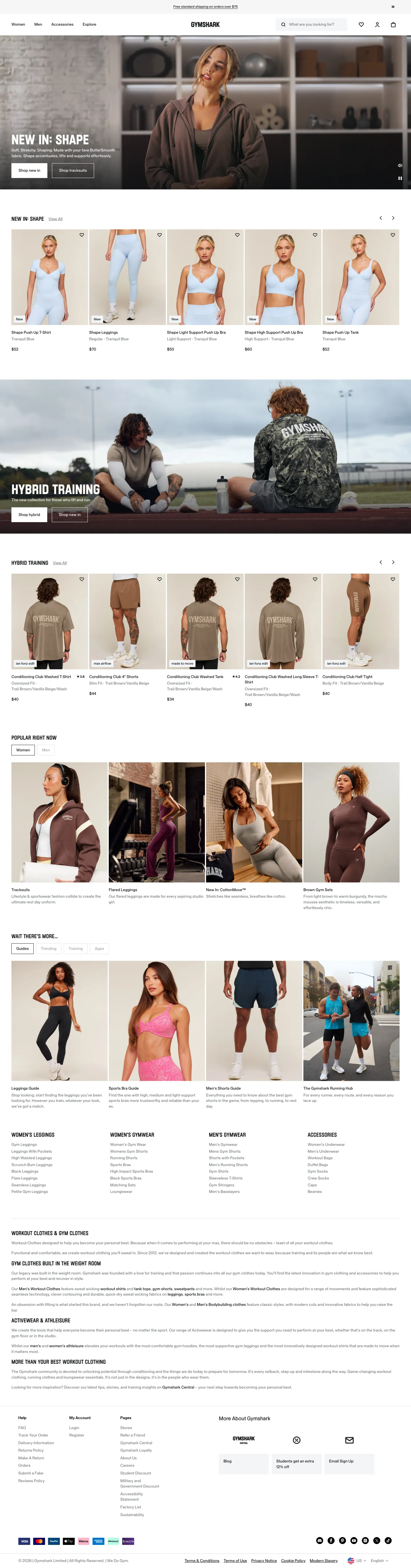
Gymshark's hero, "NEW IN: SHAPE", has two buttons, "Shop new in" and "Shop tracksuits". Directly beneath, a carousel shows the campaign's products with names, colours and prices. The next banner, "Hybrid Training", repeats the pattern: a campaign image with its own two buttons, then its products.
The image makes the shopper want it, and the products are right there when they do.
8. Comfrt: a campaign hero with the whole range one row below
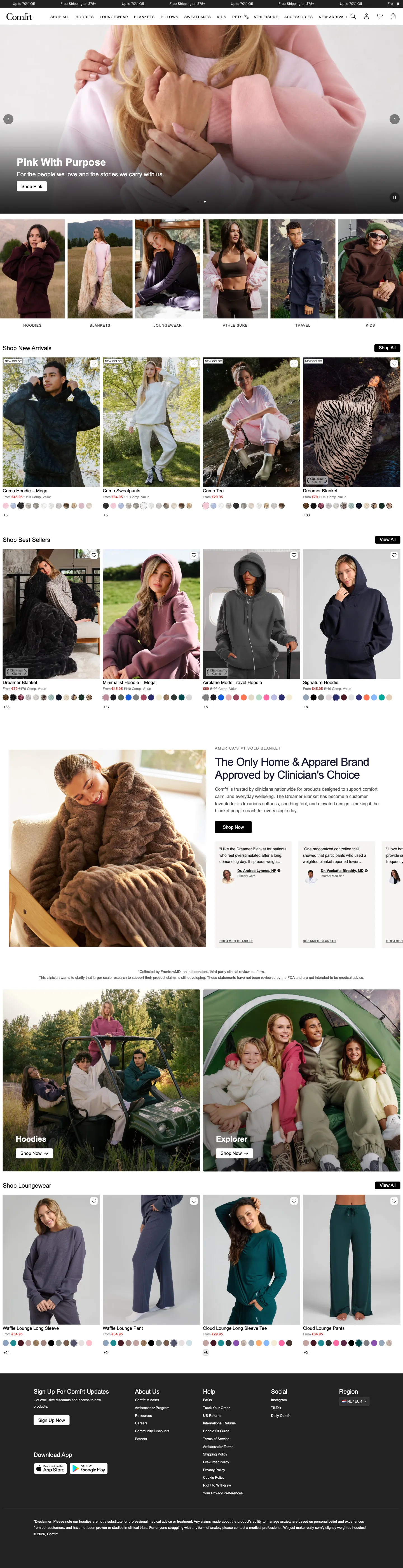
Comfrt's hero carousel is a campaign, "Pink With Purpose" ("For the people we love and the stories we carry with us"), with a "Shop Pink" button. Directly beneath it sits a row of six photo tiles: hoodies, blankets, loungewear, athleisure, travel and kids. "Shop New Arrivals" follows, with "New color" labels, rows of colour swatches and a price shown as "From €45.95" beside a struck-through "Comp. Value" figure.
The campaign gets the hero, and the shopper who is not moved by it still has every category within one scroll.
Help people into a big range
9. On: organise the range by how it is used
On has a large range, so it offers two ways in. Under "Shop", three tiles cover shoes, apparel and accessories. Below them a list of activities, among them football, running, marathon, trail running, lifestyle, and hiking and outdoor, each with an arrow, sits beside an image.
Some shoppers think "shoes", others think "running", and both can start from the page.
10. Nike: one tile per customer, one button each
Nike's grid of campaign tiles covers a different customer in each: a football story ("Nike United: Created by athletes."), a collaboration ("New From NikeSKIMS: The All-Day Uniform"), a seasonal range ("Off-Season? Never Heard of It.") and a signature shoe ("Tatum 5: Lock In To Lift Off"). Each tile has a short line and a single "Shop" button; the winter tile offers "Shop Adults" and "Shop Kids".
Every tile has one line and one button, so a very large range turns into four clear choices.
Before you copy one
These checks apply to any fashion homepage, not to the stores above.
- Make the first click obvious. A campaign image earns attention; each example here pairs it with a clear route to products.
- Date your seasonal messages. Holiday and season heroes age quickly. Plan when each one comes down.
- Make the comfort claims true. "Four-way stretch" or "buttery soft" needs to match what arrives, and any size range you state needs to be accurate.
- Check the phone. These are desktop captures. Look at hero crops, chips and carousels on a small screen.
To see more, browse the fashion stores in the library. For what happens next in the journey, see our product page design examples.
 CURVD.
 Allbirds
 Buck Mason
 Odd Muse
 wande esan
 Rothy’s
 Gymshark
 Comfrt
 On Shop
 Nike