A wellness store sells something a shopper cannot judge by looking at it: a capsule, a powder, a strip that dissolves on the tongue. So the homepage has to settle three questions before it sells anything. Is this for someone like me? Why should I trust it? What happens if it does not work?
See all health and wellness ecommerce website design examples, or read on for how ten of them work.
These ten examples come from health and wellness stores in the library: supplements, hydration, sleep, women's health and meal replacement. They are desktop homepage captures from late September to early November 2026, grouped by the main job each one does. Every clinical, certification, review and customer-count claim you see below is the brand's own. We did not verify any of them, and we do not judge whether a product works. This is about how the pages are put together.
What a wellness homepage has to do
| Job | The shopper's question | Where it shows up |
|---|---|---|
| Help me choose | Which of these is for me? | Need or goal rows, quizzes, consultations, named ranges |
| Prove it | Why believe you? | Press and ratings strips, certifications, expert and ambassador statements, evidence |
| Make the deal clear | What do I pay, and what if I'm unhappy? | Price per month, serving or meal, and guarantee lines |
Two pieces of research help explain these choices. Nielsen Norman Group's study of trustworthiness (2016) found four factors that still shape trust: design quality, up-front disclosure, comprehensive and current content, and a connection to the rest of the web. In its research people trusted external sources, such as third-party review sites and news outlets, more than company-sponsored content. On disclosure, it lists prices, shipping, return policies and guarantees.
Baymard's homepage and navigation research (updated October 2026) is about helping people find products. It reports that 61% of desktop sites in its benchmark of 180+ top ecommerce sites perform "mediocre" to "poor" on homepage and category navigation, and describes the homepage as the anchor for a site's category structure. Neither source tests wellness stores, and neither shows that any page below converts better.
Start from the shopper's need
1. Free Soul: put the way to choose above the hero
Free Soul opens with three layers before the product. A strip of three claims, "Rated 'Excellent' on Trustpilot", "Nutritionist-formulated for real results" and "Uniquely formulated for women". Below it a "Shop by need" row of eight chips: protein, active and recovery, mind and sleep, hormones and women's health, beauty and skin, stress and focus, bones and joints, and gut and immune health. Then the hero, "Nutrition designed for every woman", with a rating line and press logos underneath. A "Take the quiz" tab sits on the right edge.
The shopper can say what they need, check a reason to trust the brand and see the promise in one screen.
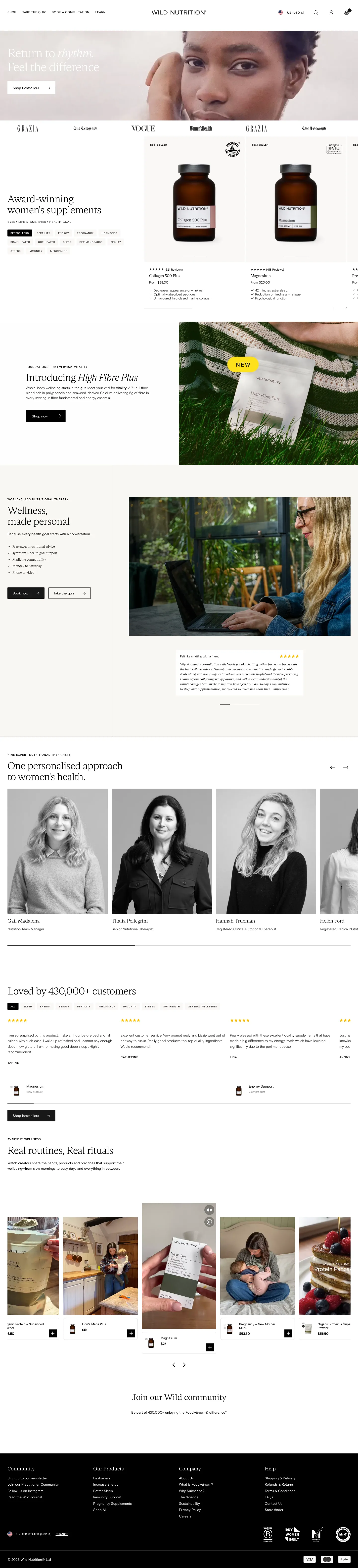
2. Wild Nutrition: offer a human route and let life stage filter the range
Wild Nutrition puts "Take the quiz" and "Book a consultation" in its navigation, so the first two routes are help from a person or a short questionnaire. Press logos sit directly under the hero. Further down, "Award-winning women's supplements", the brand's own description, comes with chips for bestsellers, fertility, energy, pregnancy, hormones, brain health, gut health, sleep, perimenopause, beauty, stress, immunity and menopause. The product cards carry review counts and short benefit ticks.
Life stage is how many shoppers in this category think about what they need, so the chips use their vocabulary.
3. Huel: start with goals, then categories, then price per meal
Huel leads with "Food to fuel your goals" and four tiles: lose weight, more protein, eat healthy and on-the-go. A second block, "Shop your way", lists six product categories. Further down, a benefits block states "From $1.52 per meal" under "Save Money" and "Love it or your money back" under "Taste Guaranteed".
The goal tiles answer "what do you want?" first and the category list answers "what format?". The price appears as a cost per meal, a unit shoppers already compare against other food.
Prove it with more than one kind of evidence
4. IM8: layer different proofs in the first two screens
IM8 fits several kinds of proof into the first two screens. The hero has an ambassador's statement, a "Clinicians' Choice" badge, a 4.8 rating from 22,104 reviews, ticks for a 90-day money-back guarantee, NSF Certified for Sport and third-party testing, and a "Lab-verified" line with a link to the report. The next section, "The daily routine behind the world's highest performers", adds a carousel of athletes and ambassadors and repeats the rating.
Each type of proof answers a different doubt: a person I recognise, other customers, an independent certification, a lab. All of it is the brand's claim.
5. Ritual: a short proof row directly under the products
Ritual's bestseller cards say who and what each product is for, for example "Essential for Women" and "Muscle + Metabolism Support", with a starting price. Directly under the carousel, a row of six icons gives the proof in a few words: "2.6 Billion Capsules Sold", "Clean Label Project Certified", "100% Ingredients Made Traceable", "$5M Investment in Clinical Studies", "Formulated by Dietitians & Scientists" and "Vegan & Non-GMO". The brand story begins immediately after.
The proof is where the shopper is looking at products, and it is short enough to scan.
6. AG1: show the range with monthly and per-serving prices
AG1 puts a strip under its hero: validated by NSF Certified for Sport, backed by industry-leading research, trusted by leading scientists and athletes, and a no-risk 90-day guarantee. Under "AG1 for Every 1" three cards show the range: Essentials Gummies at $49 a month, Next Gen at $79 a month tagged "Most popular", and Pro at $99 a month tagged "With creatine". Each card also shows a per-serving price and a short benefit list.
Showing both the monthly amount and the per-serving cost lets the shopper compare the options and see what the commitment is.
Teach the idea, then sell
7. Seed: organise the whole range around one idea
Seed's hero says "A life-changing health routine, built for your microbiome", with two buttons, "Take the Quiz" and "Shop Now". The next section, "Whole body health starts in the gut", turns the idea into the product range: four products named by function (daily synbiotic, daily multivitamin, energy and focus, sleep and restore), each with a code, a "Shop Now" button and a monthly starting price.
One idea explains why there are four products, and the two buttons serve two levels of readiness.
8. LMNT: state the belief, then show the evidence
LMNT follows its product launch with a short statement, "More Salt, Not Less", and a chart. One bar is labelled "Government recommendation" and another "Science-backed recommendation", with a risk curve and an "optimal range" marked on it. A citation to a JAMA paper sits under the chart, and a "Read more" link follows the explanation. We have not assessed the argument; the page presents it as the brand's.
The page makes its belief unmissable, shows the reasoning in a picture, and cites the source so a sceptical reader can follow it.
Let a format or a voice do the work
9. Meche: make the format the headline
Meche's headline, "Lick your vitamins.", describes the product's format in three words, and a chip above it states "Over 500,000 strips sold". A review strip with a 4.5 rating and customer quotes sits directly under the hero. "Shop The Essentials" lists products by their use, such as superfood greens, gut health and regularity, and restorative sleep.
When the format is the difference, saying it first lets the shopper decide quickly whether they are curious, and the reviews sit where that curiosity is.
10. Sleep or Die: one voice in every line
Sleep or Die uses its voice everywhere: "free shipping for zombies who subscribe" in the top bar, "fall asleep in 10 mins" with a "get ready to strip" button in the hero, "for the dead tired" above the products, and a ticker that reads "counting sheep is dead" and "so is staying awake". The hero makes one concrete promise, which is the brand's own claim.
Because the tone is the same from the top bar to the ticker, it reads as a brand and not as a theme.
Before you copy one
These checks apply to any wellness homepage, not to the stores above.
- Copy the structure, not the claims. Health claims, certifications and customer numbers need to be true for your product and current. Check the rules in your market before you reuse any wording.
- Keep proof current. A rating, a count or a "clinically backed" line that is out of date costs more trust than it earns.
- Match the route to your range. A need row helps a store with many products, and may be clutter for one with three.
- Check the phone. These are desktop captures; look at how strips, chips and carousels behave on a small screen.
To see more, browse the wellness stores in the library. For the next step in the journey, our subscription product page examples cover recurring orders.
 Free Soul
 Wild Nutrition
 Huel
 IM8 Health
 Ritual
 AG1
 seed
 LMNT
 Meche
 sleep or die