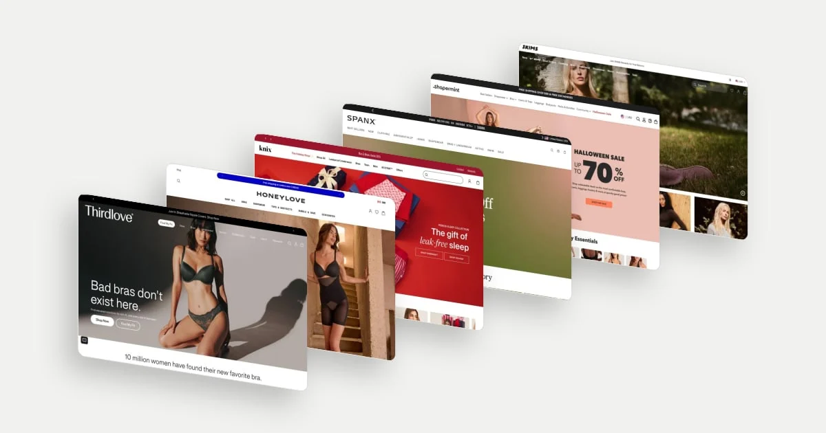
Underwear, bras and shapewear are bought for how they fit and feel, and a photograph cannot show either. The homepage has to answer three questions in the first few screens: Will it fit and stay comfortable? Why now, and what exactly do I get? Where do I start in this range?
See all fashion ecommerce website design examples, or read on for how seven of them work.
These seven examples come from underwear, bra, shapewear and basics stores in the library, grouped by the question each answers best. They are desktop homepage captures from late September to early November 2026, so seasonal and sale messages are as they were on those days. The images show products as the brands photograph them. Every claim and count is the brand's own, and we do not judge any product. This is about how the pages are put together.
What an intimates homepage has to do
| Job | The shopper's question | Seen here |
|---|---|---|
| Fit | Will it fit and stay comfortable? | ThirdLove, Honeylove |
| The occasion and the offer | Why now, and what exactly do I get? | Knix, SPANX, Shapermint |
| A range | Where do I start? | Bombas, SKIMS |
Three pieces of research help explain the choices. Baymard's apparel research found that uncertainty about sizing was a common reason to abandon a product, and its benchmark found that 83% of desktop apparel sites (and 87% of mobile) do not provide sufficient sizing information. That research is about product pages (2022), not homepages; the first two examples show how stores bring fit forward before the shopper reaches a product.
Nielsen Norman Group's study of trustworthiness (2016) lists up-front disclosure as a factor in trust: stating what a price includes and any additional charges. The sale examples below apply the same idea to discounts, by saying how a discount works.
Baymard's homepage and navigation research (updated October 2026) describes the homepage as the anchor for a site's category structure and reports that 61% of desktop sites in its benchmark of 180+ top ecommerce sites perform "mediocre" to "poor". None of these sources tests the stores below, and none shows that any page converts better.
Make fit the first click
1. ThirdLove: put the fit tool and the size range beside the buy button
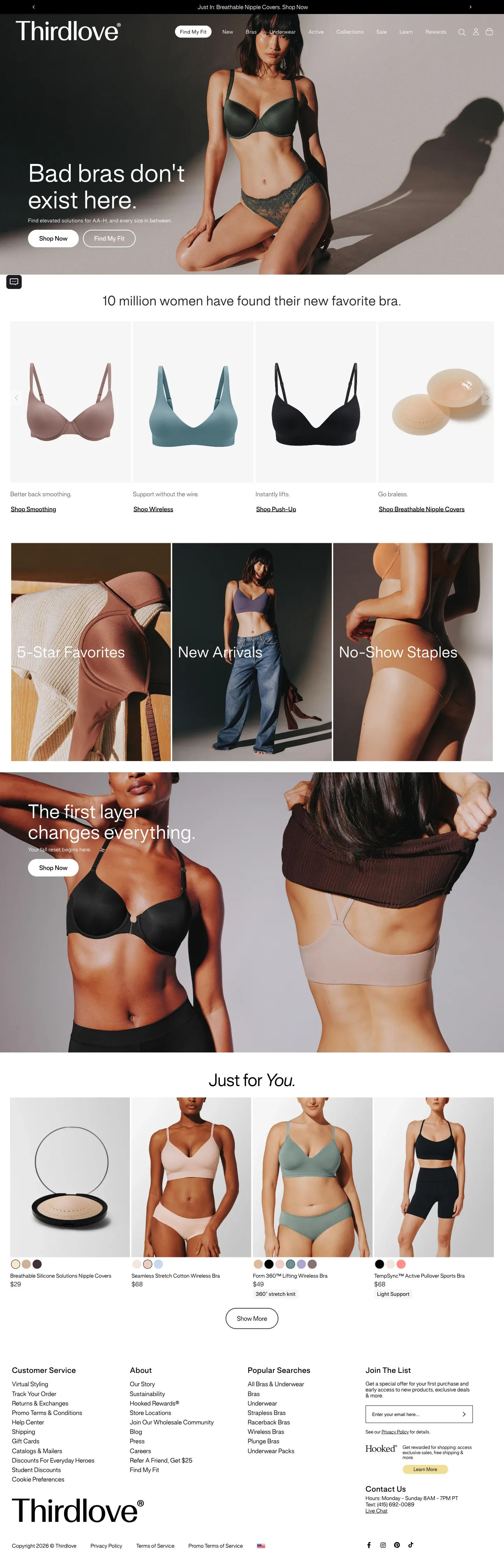
ThirdLove puts "Find My Fit" in the navigation as a pill and again as the second button in the hero, next to "Shop Now". The hero says "Bad bras don't exist here" and "Find elevated solutions for AA-H, and every size in between", so the size range is stated in the first screen. Below, "10 million women have found their new favorite bra" (the brand's claim) introduces four product cards. Each has one benefit line and a link named for the need: "Better back smoothing. Shop Smoothing", "Support without the wire. Shop Wireless", "Instantly lifts. Shop Push-Up" and "Go braless. Shop Breathable Nipple Covers".
The cards describe what each product solves, in the shopper's words, before they describe a product.
2. Honeylove: explain what each style does, with a toggle
Honeylove shows a compact "Bestsellers" strip of seven named products near the top, so the shopper sees the range without scrolling far. A section headed "Bras and shapewear, completely reimagined" follows, with a Bras and Shapewear toggle and three feature cards, each with an icon and a short explanation: "Wireless lift", "Invisible under clothes" and "All-day comfort".
Fit-sensitive products carry a lot of unknowns. The cards say what each design is meant to do, and the toggle lets the shopper stay in their own category.
Sell the occasion and the offer
3. Knix: put the occasion on the same level as the category
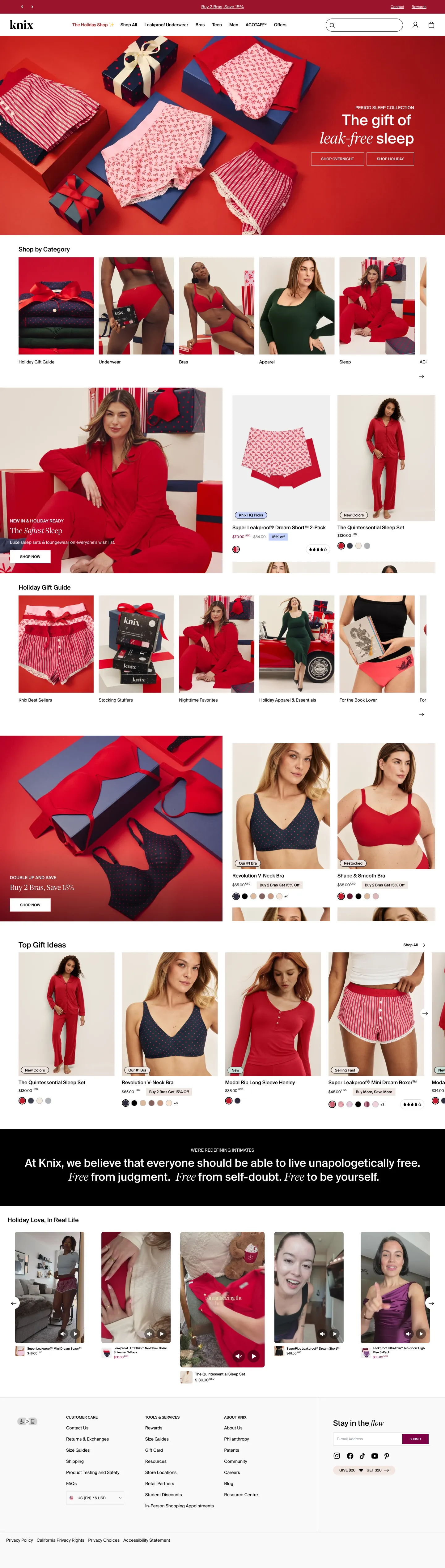
Knix puts "Buy 2 Bras, Save 15%" in the top bar and "The gift of leak-free sleep" in the hero, with "Shop overnight" and "Shop holiday" buttons. Under "Shop by Category", the first tile is a "Holiday Gift Guide", before Underwear, Bras, Apparel and Sleep. A feature, "The Softest Sleep", sits beside two product cards: one shows a price with a struck-through original and a "15% off" tag, another a "New Colors" tag, and the first has a row of droplet icons (we did not check what they measure).
A shopper arriving for a gift and one arriving for a bra both see their route straight away.
4. SPANX: say how the discount works and sort the sale by garment
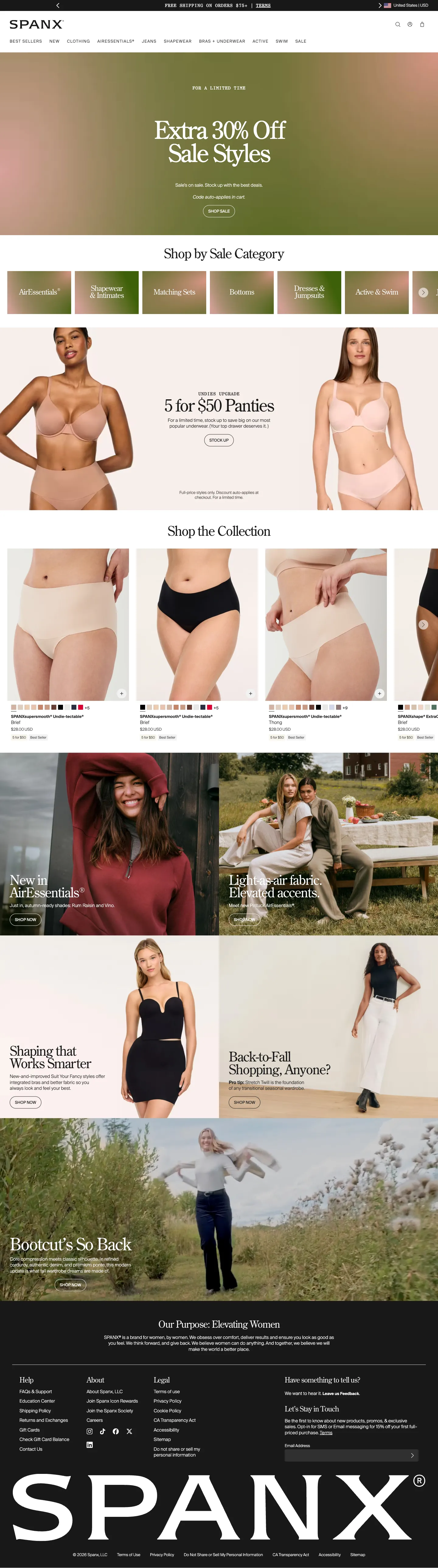
SPANX leads with a sale, "Extra 30% Off Sale Styles", and states the mechanics under the headline: "Code auto-applies in cart." Under "Shop by Sale Category", tiles for AirEssentials, shapewear and intimates, matching sets, bottoms, dresses and jumpsuits, and active and swim let the shopper go straight to the type of garment. A multi-buy tile, "5 for $50 Panties", carries its conditions in visible small print: "Full-price styles only. Discount auto-applies at checkout."
The shopper learns that no code is needed and what the offer covers before they click.
5. Shapermint: show the sale, the categories and the proof in one scroll
Shapermint opens with a "Halloween Sale: up to 70% off" hero and then a row of nine photo categories: the sale itself, bras, tanks and camis, leggings, shorts, hosiery, underwear, bodysuits and swimwear. "Our Best Sellers" follows, with a "Halloween Sale" tag on each card, a struck-through original price beside the sale price, "Best seller" and "Selling fast" labels, and a count beside the stars that runs from 1,420 to 30,347.
The sale, the product types and the evidence that others bought them sit within one screen.
Help people into a range
6. Bombas: three routes and a mission
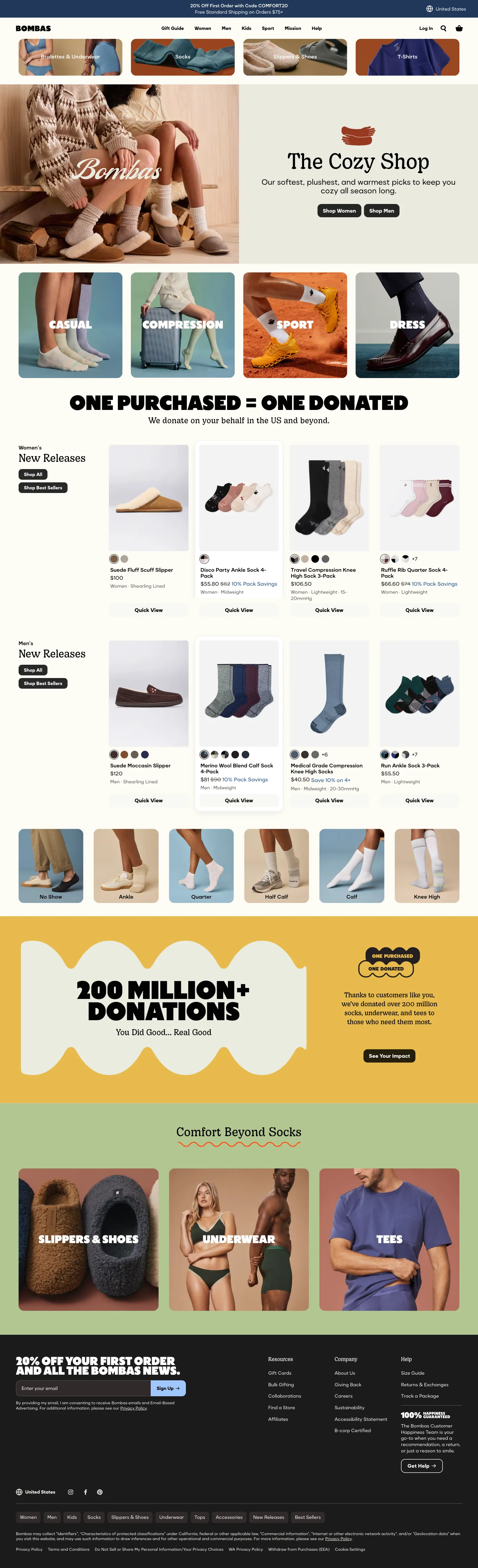
Bombas opens with a row of category tiles, bralettes and underwear, socks, slippers and shoes, and T-shirts, above a seasonal hero, "The Cozy Shop", with "Shop Women" and "Shop Men" buttons. Four use tiles follow: casual, compression, sport and dress. A headline-sized statement, "One purchased = one donated", with "We donate on your behalf in the US and beyond" (the brand's claim) sits between the browsing sections and the product rows.
The page gives three ways in, by category, season or use, and puts the brand's mission between them as a statement.
7. SKIMS: let the first screen say the range is bigger than the name
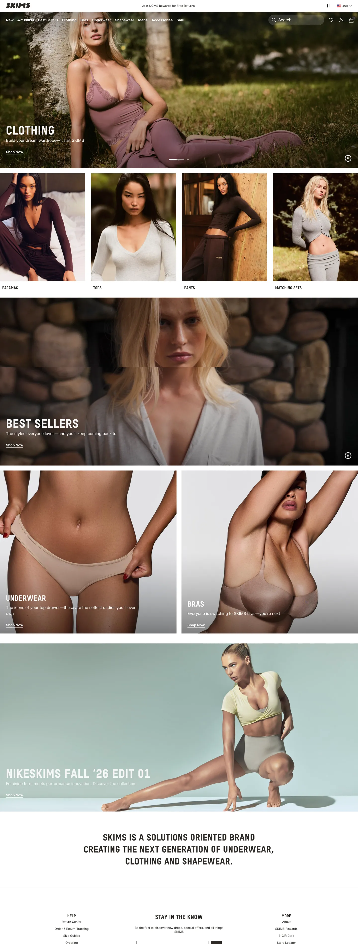
SKIMS' hero is labelled "Clothing", with "Build your dream wardrobe, it's all SKIMS" and a "Shop Now" button, and the navigation spans new, NikeSKIMS, best sellers, clothing, bras, underwear, shapewear, mens, accessories and sale, with a search box. Four tiles follow: pajamas, tops, pants and matching sets. A pause button sits on the hero.
A shopper who knows the brand for underwear is shown the rest of the range straight away, and the pause button gives a visitor control of the moving hero (we did not test it).
Before you copy one
These checks apply to any underwear, bra or shapewear homepage, not to the stores above.
- Make fit claims true. A stated size range, a "no bra needed" line or a stretch claim needs to match what arrives.
- Explain the deal. If a sale applies automatically, or only to full-price styles, say so where the shopper sees it.
- Date your seasonal messages. Holiday and sale heroes age quickly. Plan when each one comes down.
- Check the phone. These are desktop captures; look at how tiles, chips and carousels behave on a small screen.
To see more, browse the fashion stores in the library. For what happens next in the journey, see our product page design examples.
 Thirdlove
 Honeylove
 Knix
 SPANX
 Shapermint
 Bombas
 SKIMS