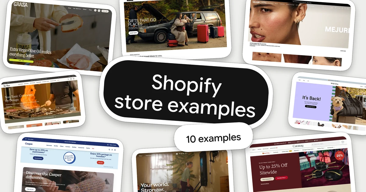
If you are building a Shopify store, the useful question is not "which stores look good?" but "what did they put on the homepage, in what order, and can I do the same?" This article answers that with ten real Shopify stores and with numbers from the 168 Shopify stores in our library.
See all our homepage examples, or read on for the ten.
One note on scope. These are desktop homepage captures from late September to early November 2026. Offers, prices and claims are each brand's own, as shown on the capture date. We looked at how the pages are put together; we did not test them, and nothing here says one layout sells more than another.
The 10 Shopify website examples at a glance
| Store | Sells | Study it for |
|---|---|---|
 Graza | Olive oil | One product, one promise |
 Liquid Death | Canned drinks | Personality without confusion |
 Mejuri | Jewellery | Close-up product photography |
 Our Place | Cookware | Two ways into a big range |
 Away | Luggage | A seasonal hero over fixed categories |
 Wild One | Pet gear | A timely reason to visit |
 Casper | Mattresses | Reassurance before products |
 Tonal | Home gym | Ways to pay, next to the hero |
 AG1 | Supplements | Proof strip, then "which one is mine" |
 Caraway | Cookware | A tiered offer you can read at a glance |
How a store is built matters if you plan to copy something. Seven of the ten run on Shopify's own theme system, the one you edit in the theme editor. Three are custom-built: Mejuri and Caraway on Hydrogen, which Shopify describes as its "headless toolkit", and AG1 on another custom front end. The ideas on those three still transfer, but the pages were built in code, not assembled from theme sections. We detected this from each page's code; we did not check which theme or apps any store uses.
What Shopify homepages have in common
We tag every section of every homepage in the library. Across 151 Shopify stores with a tagged homepage (leaving out the custom Hydrogen builds), this is how often each block appears:
| On the homepage | Share of stores |
|---|---|
| A hero at the top | 97% |
| A row of featured products | 91% |
| Proof: reviews, press logos, customer photos or trust badges | 73% |
| An announcement bar | 53% |
| Category tiles (a collection list) | 50% |
Two more things stood out:
- Products come early. On 42% of these homepages, the first thing after the hero is a row of products. On 17% it is category tiles. Very few make shoppers scroll through brand story first.
- The same tools sit underneath. We detected Shop Pay, Shopify's one-tap checkout, on 86% of the stores, the email tool Klaviyo on 80%, and a reviews app on 69%.
Treat these as a description of our library, not of every Shopify store. It leans towards established direct-to-consumer brands, mostly in beauty, wellness and food, and both the tagging and the app detection can miss things.
The shape still helps as a starting point: a hero, products or categories straight after it, then proof. Common does not mean proven. We can see what these stores built, not what it earned them. The ten stores below show what to do inside that shape. Baymard's homepage and navigation research (updated 13 October 2026) calls the homepage "an escape route and anchor" for a site's categories, and rates 61% of desktop sites' homepage and category navigation as "mediocre" to "poor" across 180+ large US and European stores. That is usability research, not sales data, but it explains why the examples that make a range easy to enter are worth the closest look.
Let the brand voice do the selling
1. Graza: one product, one promise
Graza opens on food, not on a bottle: a knife, bread and a jar, under "Extra Virgin Olive Oil makes everything better." with one "Shop now" button. A thin ticker names where this season's olives come from. Then a bright yellow block introduces a second product, potato chips cooked in the oil.
A store with one main product does not need a menu of choices at the top. It needs a reason to want the product, and "makes everything better" is that reason in five words. The yellow block shows how to add a second product later: give it its own colour and its own block, and the first message stays intact.
2. Liquid Death: jokes in the headline, facts in plain type
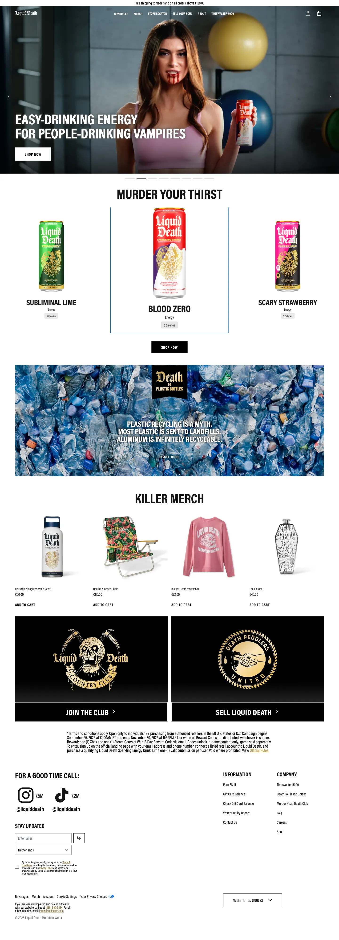
Liquid Death puts its humour everywhere a shopper is not making a decision: the hero ("Easy-drinking energy for people-drinking vampires"), the section title ("Murder your thirst"), even the menu ("Sell your soul"). Where a decision happens, under each can, the type goes plain: flavour, product type, "5 Calories".
That split is the lesson. Personality makes the brand memorable, but a joke in the wrong place hides what a product is. Here a first-time visitor can laugh at the headline and still tell three cans apart in a second.
Explore Liquid Death in the library
Show the product close up
3. Mejuri: every photograph is a way in
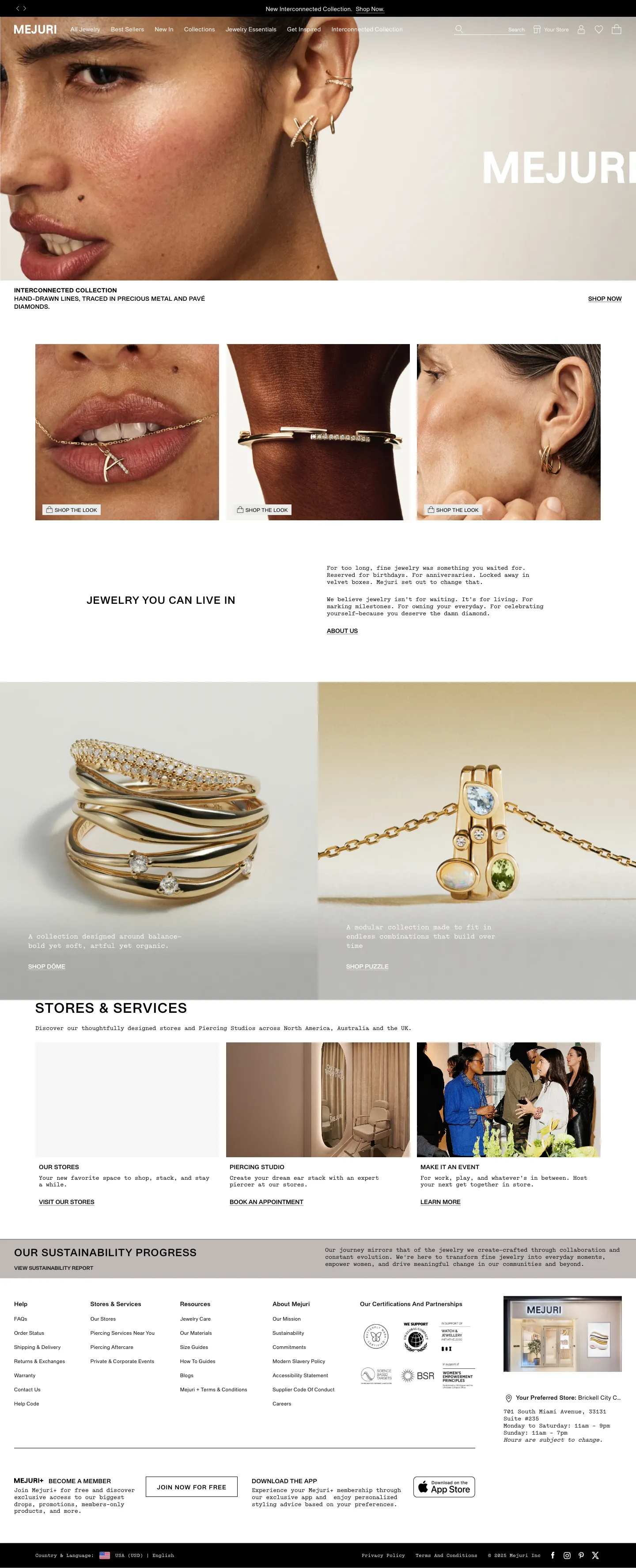
Mejuri fills the first screen with an ear and a stack of earrings, then shows three more close-ups: a pendant at the lips, a bracelet on a wrist, earrings again. Each has a small "Shop the look" button in its corner.
Jewellery is small, and a shopper's first questions are about scale and how a piece sits on a body. Close-ups on skin answer both better than a product on a white background. The buttons matter as much as the photography: no image is only decoration, so interest in a picture turns into a visit to that product.
Make a big range easy to enter
4. Our Place: two routes into the same range
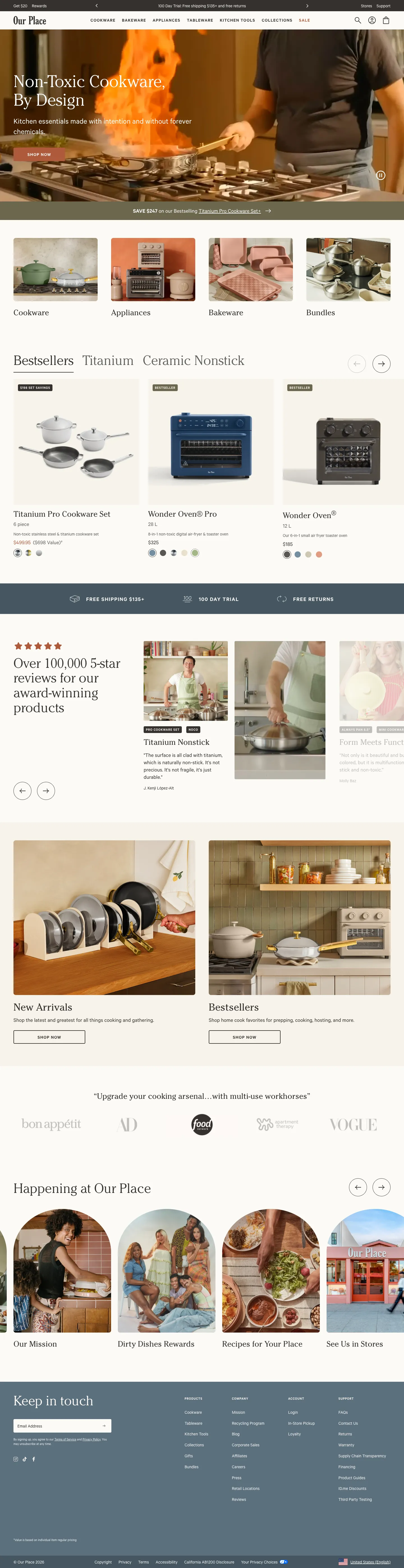
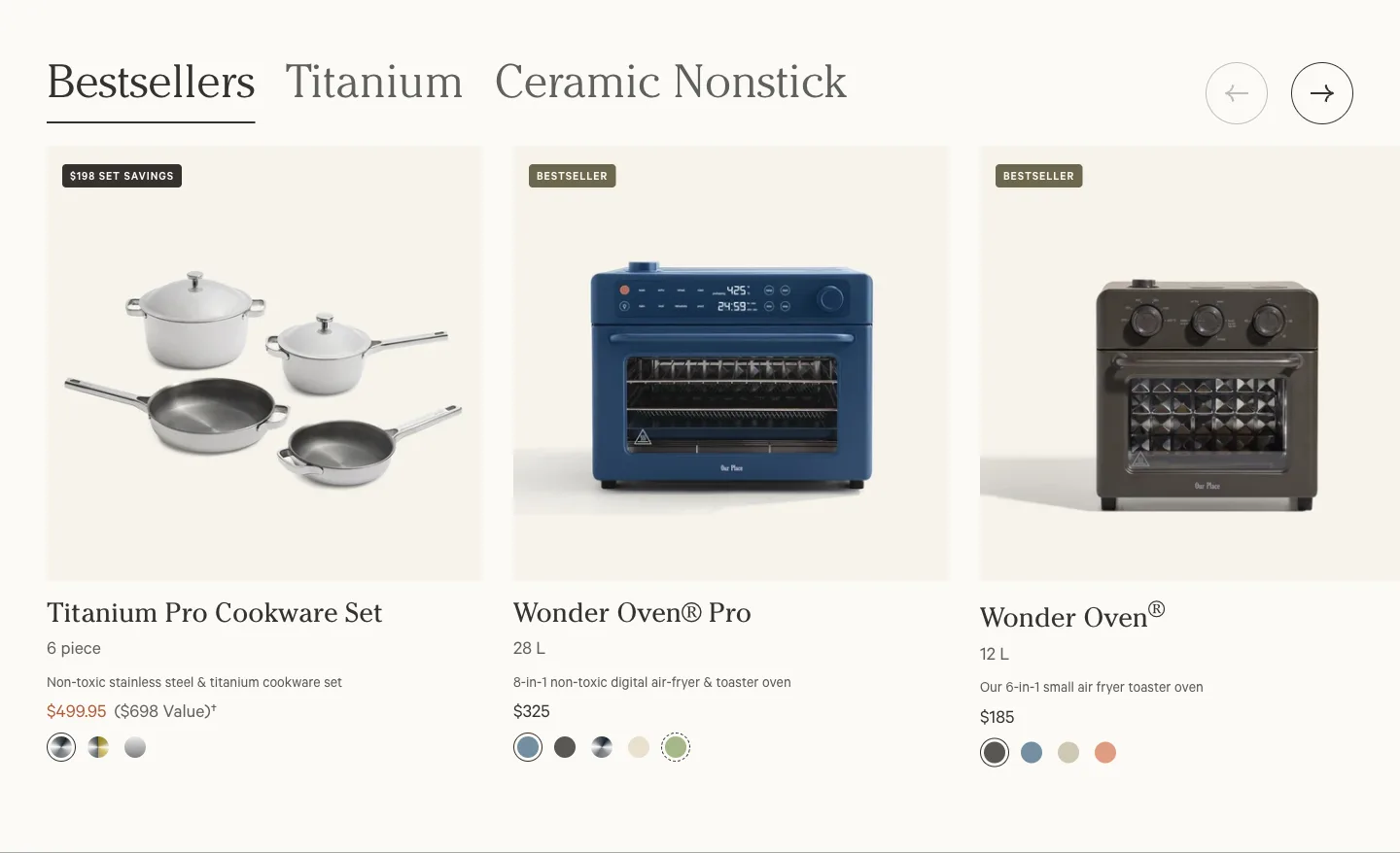
Under its hero, Our Place offers four picture tiles: Cookware, Appliances, Bakeware and Bundles. Directly below, a "Bestsellers" row has tabs for "Titanium" and "Ceramic Nonstick". The top bar carries the standing promise: a 100-day trial, free shipping over $135 and free returns.
Shoppers arrive with different questions. One knows they need a pan; another has heard about a material and wants to see it. Tiles serve the first and tabs serve the second, and both sit within one scroll of the top. Half the Shopify homepages in our library have category tiles. Our Place adds a second route right beside them.
Explore Our Place in the library
5. Away: change the hero, keep the doors
Away's hero is a seasonal campaign, "Gifts that go places". Below it, four tall photographs act as doors to the range, each with one button: "Shop luggage", "Shop bags", "Shop accessories", "Shop gifts".
The page separates what changes from what stays. The hero can follow the calendar, while the four tiles underneath give a returning shopper the same way in every time. That makes seasonal updates cheap: one image and one headline, with no need to rebuild the page.
6. Wild One: give people a reason to come back today
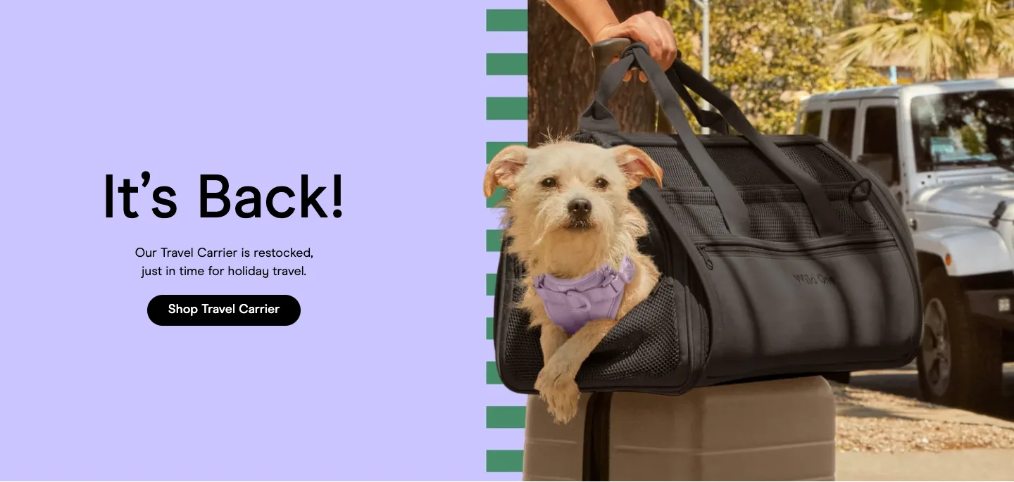
Wild One's hero reads "It's Back!": the travel carrier is restocked, "just in time for holiday travel". Four tiles follow, labelled by what people buy: Dog Walk Kits, Dog Harnesses, Poop Bags, Cat Collection. Then comes a row of short vertical videos of pets with the products.
A restock is news, and news is a reason to visit now. It also hints to a new visitor that the product is in demand. The tiles use product photographs and plain names, so a pet owner can find a harness without learning the brand's vocabulary first.
Explore Wild One in the library
Reassure shoppers who are making a bigger purchase
7. Casper: reassurance before products
Casper's hero has one button, "Take the quiz". Under it, a strip of four icons lists a 100-night trial, a 10-year limited warranty, free mattress delivery and "110,000+ 5 Star Reviews" (the brand's claims, with conditions marked). A large review panel follows. The mattresses themselves come later.
Many stores show products straight after the hero. Casper does not, because a mattress cannot be judged from a picture. The page first helps the shopper choose (the quiz) and then addresses the fear of choosing wrong (trial, warranty, delivery). Only then does it show what to buy.
8. Tonal: say how to pay for it, up front
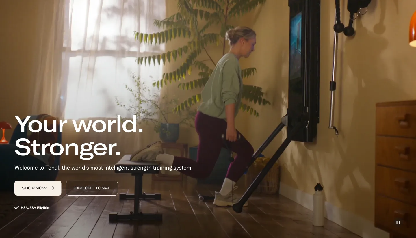
Tonal shows its trainer on the wall of an ordinary living room. Under the hero buttons sits a small note, "HSA/FSA Eligible", and the next block is a rental offer: first month free, then a monthly price, with an end date.
For a product at this price, "can I afford it?" comes before "do I want it?". Tonal answers the money question twice in the first screen and a half, then moves on to benefits. The room setting does similar work for a second worry, whether the thing will fit at home.
9. AG1: credentials, then a clear choice
Under its hero, AG1 runs one strip of four proof points: a named certification, research, scientists and athletes, and a 90-day guarantee (all the brand's claims). Then three product cards sit side by side, two of them tagged: "Most popular" and "With creatine".
A supplement shopper has two questions: who stands behind this, and which version is for me? The strip answers the first in a single line of the page. The tags answer the second without a comparison chart, because each says in two words who that product suits.
Run a promotion without losing the page
10. Caraway: draw the offer, do not describe it
Caraway's sale has three tiers and a free gift, which would take a paragraph to explain. The page draws it instead: "15%", "20%" and "25%" as large numbers, each with its order value underneath, and the gift as a fourth panel. A dark strip below repeats the standing promises: free shipping over a set amount, returns and a 30-day trial.
Big numbers with a threshold under each let a shopper find their own tier at a glance and see how far the next one is. The strip underneath does a quieter job: it keeps the everyday reasons to buy visible while the sale takes over the top of the page.
Explore Caraway in the library
Questions about Shopify store examples
How can you tell if a store is built on Shopify?
Shopify stores load files from Shopify's own servers, and many show Shop Pay at checkout. We detected Shopify on all ten stores here from each page's code. That tells you the platform. It does not tell you which theme or apps a store uses.
Do all Shopify stores use a theme?
No. Of the 168 Shopify stores in our library, 142 run on Shopify's theme system. The rest are custom-built on Hydrogen or another front end, or we could not tell. Custom builds are written in code, so they need developers. If you are starting out, a theme is the normal route, and seven of the ten stores above use one.
Can I copy a Shopify store's design?
Copy the structure, not the content. The order of blocks, the idea of a guarantee strip or two routes into a range are free to use. Photographs, copy and logos are not. What you can build without code also depends on your theme: Shopify's help centre says "the sections and blocks that are available in the theme editor depend on your theme and theme version".
What if I am dropshipping?
The same shape applies, but the stores above are recognisable because of their own photography and voice, not their layout. If your products come from a supplier, your own pictures, a clear promise and honest delivery times are what make the store feel like yours.
Before you copy one
- Start from your shopper's question. Each store above answers a different one. Pick the example whose question matches yours.
- Check the phone. These are desktop captures. Look at how heroes crop and how tiles and carousels behave on a small screen in your own theme.
- Check your claims. Trial lengths, warranties and review counts must match what you really offer.
To see more, browse our homepage examples. For what happens after the click, see our product page design examples and our hero section design examples.